I often see buyers mix up cheetah print vs leopard print, and I see returns rise. The problem feels small, but it can ruin a full outfit. I fix it with simple spot rules and smart styling.
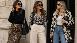
Cheetah vs leopard print comes down to spot shape, spacing, and contrast, and you can add seven animal prints this season by starting with one “hero” piece and keeping the rest of the outfit calm and clean.

I learned this the hard way when I approved a bulk sample that looked “fine” in the office light, but looked busy and muddy in daylight, so I built a checklist, and I want you to use it too, because the next section makes the spots easy to read.
What’s the difference between leopard print and cheetah print?
I still meet people who say “leopard print is leopard print,” and I understand why. The prints look close on a hanger, and the difference feels tiny. The problem shows up later, when the print looks cheap in photos and customers complain.
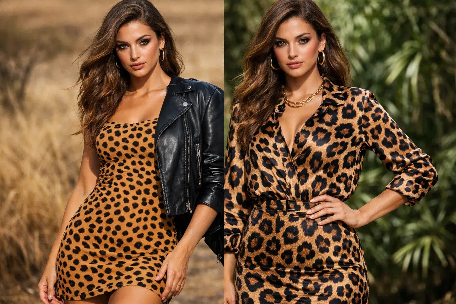
The difference between leopard and cheetah print is clear when you look at the spot edges: leopard spots often look like rosettes with darker outlines, while cheetah spots look like smaller solid dots with more even spacing.

Spot shape and outline
I teach my team to start with the outline. Leopard print versus cheetah is mostly about the “ring.” Leopard spots often have a dark border and a softer center. Cheetah spots often look filled in, like ink dots. I also look at the spot size. Cheetah print spots often feel smaller and more regular. Leopard print spots often feel larger and more varied. If you ask me “what does cheetah print look like,” I answer: small solid dots, clean edges, and a lighter base that shows more.
Color and contrast
I also watch contrast. Leopard pattern can carry strong contrast, and it can still look classic. Cheetah print can look flat if the dye is weak, so I want clean dark dots and a base that does not look gray. I check the print on both the face and the back side of the fabric. I also stretch the fabric, because bad printing can crack and the dots can break.
| Feature | Leopard print | Cheetah print |
|---|---|---|
| Spot look | Rosettes, often with outline | Solid dots, often no outline |
| Spot size | Medium to large, varied | Small to medium, more even |
| Spacing | Mixed, can cluster | More even spacing |
| Contrast | Can be strong and rich | Needs clean dots to avoid “muddy” look |
| Best first item | Coat, skirt, dress | Top, slip dress, sneakers, scarf |
How I decide in production
When I make a bulk order, I ask my printing team for two strike-offs under two lights. I check office light and daylight. I also shoot quick phone photos, because customers buy with photos. A print that looks “fine” in person can look messy on camera. This is why “leopard vs cheetah print pictures” matter in real sales, even if we do not like to admit it.
Which 7 animal prints should I add to my wardrobe this season?
I see many people buy one animal print item, then they stop wearing it after two weeks. The item feels hard to match, and the print feels too loud. I solve this by picking prints with a clear “job” in the outfit.
You can add seven animal print styles by choosing one print as the hero, keeping the rest of the outfit in solid colors, and rotating prints by mood: leopard and cheetah for classic warmth, zebra and snake for sharp contrast, and cow and giraffe for playful texture.

The seven prints I use most
I will name the seven prints I see sell well across many markets. I also include how I use them in real outfits, because “animal print fashion” only works when it feels easy.
1) Leopard print: I use it when I want a classic look with edge.
2) Cheetah print: I use it when I want softer energy and easy pairing.
3) Zebra print: I use it when I need high contrast and clean lines.
4) Tiger stripe: I use it when I want bold motion, but I keep the cut simple.
5) Snake print: I use it when I want a sleek feel, often on boots or bags.
6) Cow print: I use it when I want playful and modern, often black-and-white.
7) Giraffe print: I use it when I want warm texture that feels less “wild” than leopard.
How I match print to product
In my factory, I see the same rule again and again. Some prints look best on large surfaces, and some prints look best on small accents. If Maria asks me “cheetah or leopard print,” I ask her first: “What is the hero item?” Then I choose based on scale and season.
| Best vibe | Best items | Easy solid colors | |
|---|---|---|---|
| Leopard print | Classic, confident | Coat, midi skirt, dress | Black, cream, camel |
| Cheetah print | Light, playful | Top, slip dress, sneakers | White, tan, denim blue |
| Zebra print | Sharp, modern | Pants, knit top, bag | Black, white, gray |
| Tiger stripe | Bold, strong | Statement jacket, dress | Black, brown, beige |
| Snake print | Sleek, “clean” | Boots, belt, bag | Black, stone, olive |
| Cow print | Fun, trendy | Jacket, bag, skirt | Black, white, denim |
| Giraffe print | Warm, soft texture | Blouse, scarf, skirt | Brown, cream, rust |
When I plan a season line, I do not push every print at once. I pick two core prints and one “test” print. I also keep fabric quality high, because animal prints look cheap fast when the fabric pills or the print bleeds.
How do I wear animal print without feeling too loud?
I know the fear. I also had days where I put on a leopard print skirt, then I changed three times, and I still felt unsure. The print was not the problem. The outfit plan was the problem.
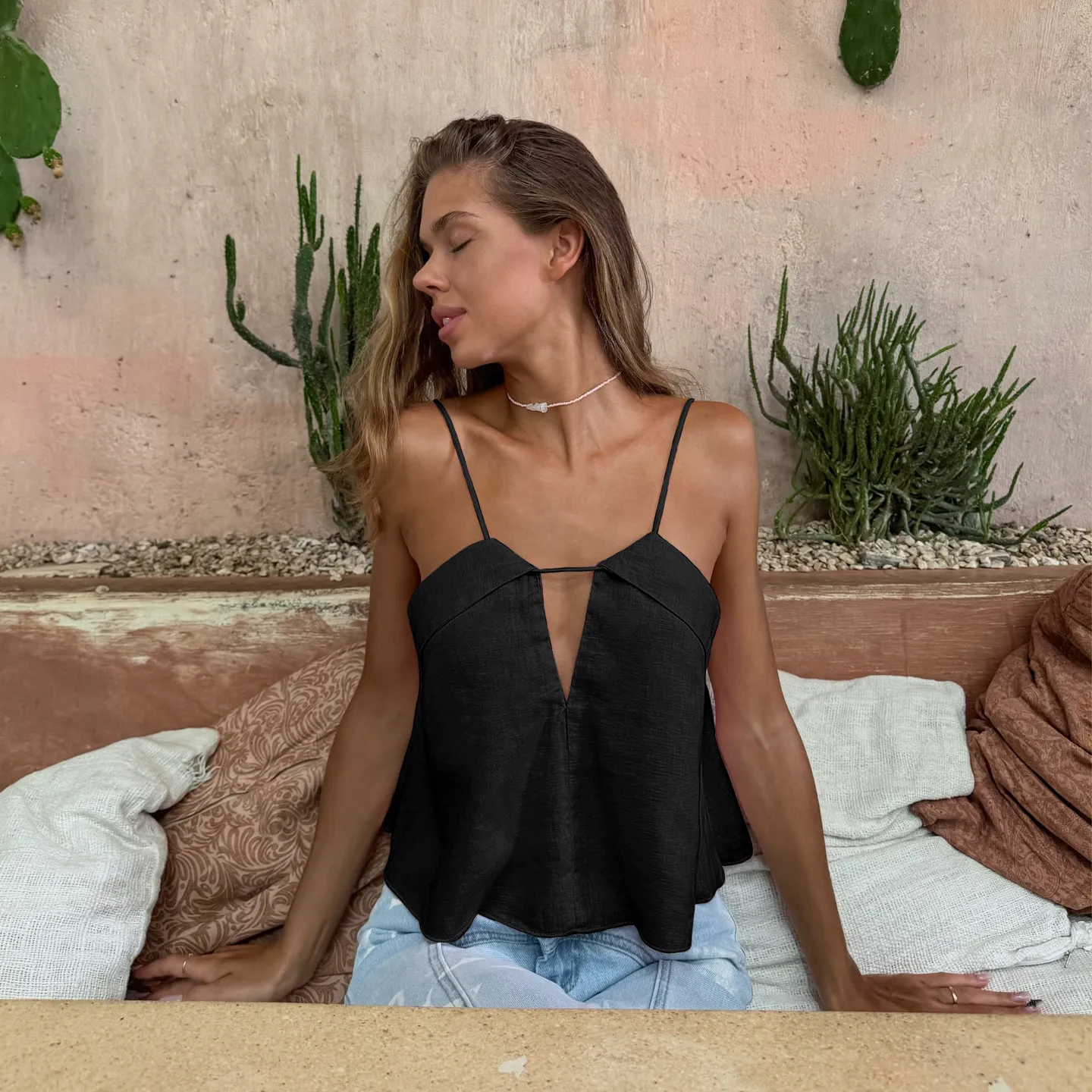
You can wear leopard print vs cheetah print with confidence by using one printed piece, using solid basics around it, and choosing simple shapes, because the print already does the “talking” for you.

My simple rules that work in photos and in real life
I use rules that my team can follow, and rules that customers can follow. I avoid complex style advice, because people want fast wins.
Rule 1: One hero piece.
If I wear a cheetah print skirt, I wear a plain top. If I wear a leopard pattern coat, I wear plain jeans.
Rule 2: Match the base color first.
I check the background color of the print. I then match that base with a solid. This makes the outfit feel calm.
Rule 3: Keep hardware simple.
I avoid too much shine. I avoid big logos. I let the pattern lead.
Rule 4: Use texture, not more pattern.
I add knit, denim, leather, or suede. I do not add another busy print.
| Outfit goal | Do | Avoid |
|---|---|---|
| Office-ready | Leopard print blazer + black pants | Leopard blazer + striped shirt |
| Weekend casual | Cheetah print sneakers + denim | Cheetah shoes + printed bag |
| Evening look | Leopard dress + simple heels | Leopard dress + heavy jewelry |
| Street style | Zebra pants + solid hoodie | Zebra pants + graphic tee chaos |
| Minimal look | Snake belt + all-black outfit | Snake belt + snake boots + snake bag |
Mixing cheetah and leopard print
People ask me about cheetah and leopard print together. I do it, but I do it in a controlled way. I mix only when one piece is very small, like a belt or scarf. I also keep both prints in the same color family, so the look feels planned, not random. If you want “cheetah print and leopard print difference” to work for you, you must keep the sizes different. Big leopard plus tiny cheetah can work. Big plus big looks like noise.
How do I buy animal print for my brand and avoid quality surprises?
I work in wholesale, so I see the sourcing risks up close. I also know Maria’s pain points. Poor communication can break a season. Delayed delivery can miss a sales window. Fake certificates can destroy trust.
You can source leopard print and cheetah print safely by locking print standards early, approving strike-offs under clear lighting rules, and running basic fabric tests for colorfastness, shrinkage, and rubbing, because animal prints show flaws faster than solids.

Print control that saves a season
I use a “print control pack” for every animal print order. I include a color target, a spot scale target, and a repeat size target. I also define what “acceptable” means. If I do not define it, the supplier will guess, and guessing costs money.
Tests I treat as non-negotiable
I do not treat testing as a luxury. I treat it as protection. Animal print runs across seams and curves, so defects show fast. I check color bleeding and rubbing, because bags and coats rub on prints. I check shrinkage, because spot spacing can change after wash.
| Risk | What I check | How I check it | Why it matters |
|---|---|---|---|
| Color bleeding | Colorfastness to washing | Lab test or quick wash test | Prints can stain other items |
| Rubbing | Dry and wet rub | Simple rub cloth test | Dots can “ghost” and fade |
| Repeat mismatch | Pattern repeat size | Measure repeat on fabric roll | Bad repeat looks cheap |
| Spot distortion | Stretch and recovery | Stretch fabric and re-check spots | Spots can become oval and ugly |
| Certificate trust | Authentic docs | Verify issuer, match product scope | Fake papers can kill a deal |
| Delivery slip | Timeline control | Critical path plan + weekly updates | Late delivery misses season |
Communication that buyers actually need
I keep my messages short. I include photos with a ruler. I include dates. I write “approved” or “not approved” in one line. I do not hide problems. If a print batch shifts, I say it early, because early action is cheaper than late action. This is how I protect the buyer’s margin, and this is how I protect my factory’s reputation.
Conclusion
I use simple spot rules to tell cheetah print vs leopard print, and I use one-hero styling and strict QC, so animal prints feel easy, modern, and profitable.
Why I Write This
I run Truekung in China, and I focus on B2B wholesale clothing and OEM/ODM.
- Name: Lancy Chia
- Email: [email protected]
- Website: https://truekung.com
- Factory: 200+ workers, 20 years export experience
- Products: women’s fashion, jackets, skirts, dresses, jeans, T-shirts, sweatshirts, down jackets, windbreakers, coats, bags, sportswear, kidswear, underwear
- Export markets: Netherlands, Denmark, Belgium, Norway, UK, USA, Germany, Australia, Thailand, Turkey, Italy, Russia, Saudi Arabia, and more
Views: 217