Do you ever feel overwhelmed by the endless colour options when creating a clothing line? I used to feel the same, until I saw how neutral colours solve many problems—silently but powerfully.
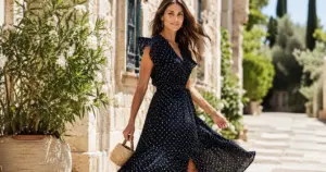
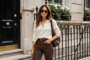
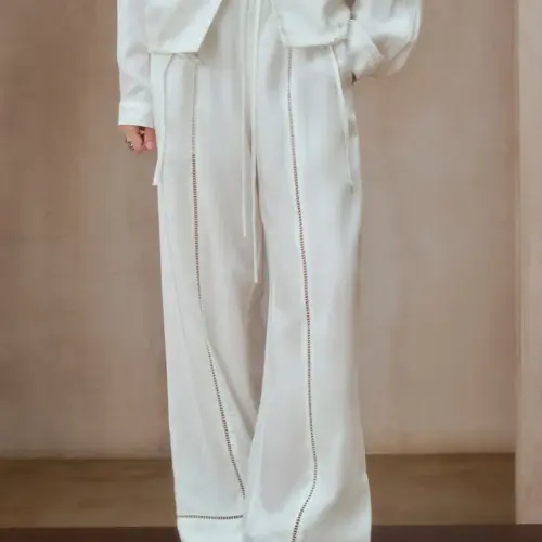
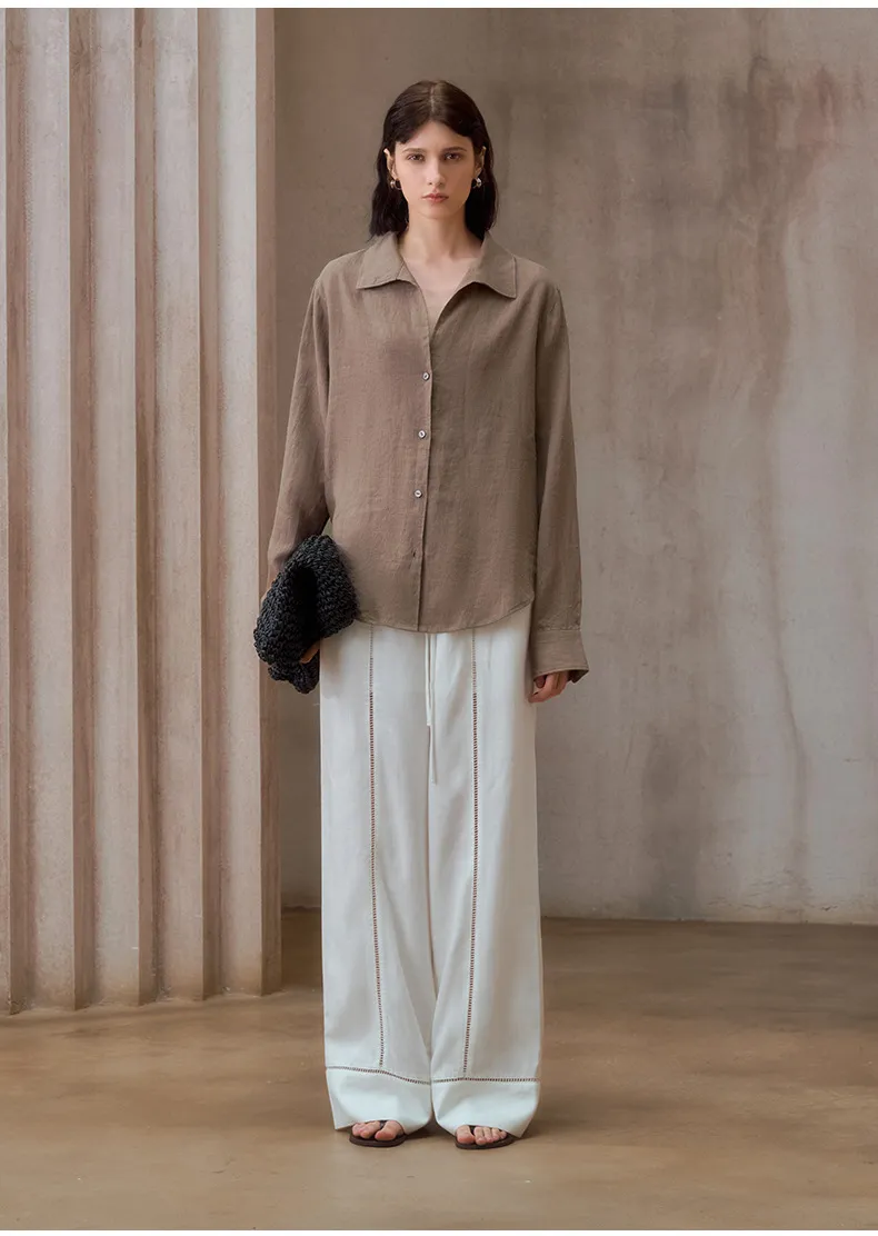
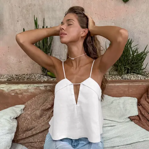
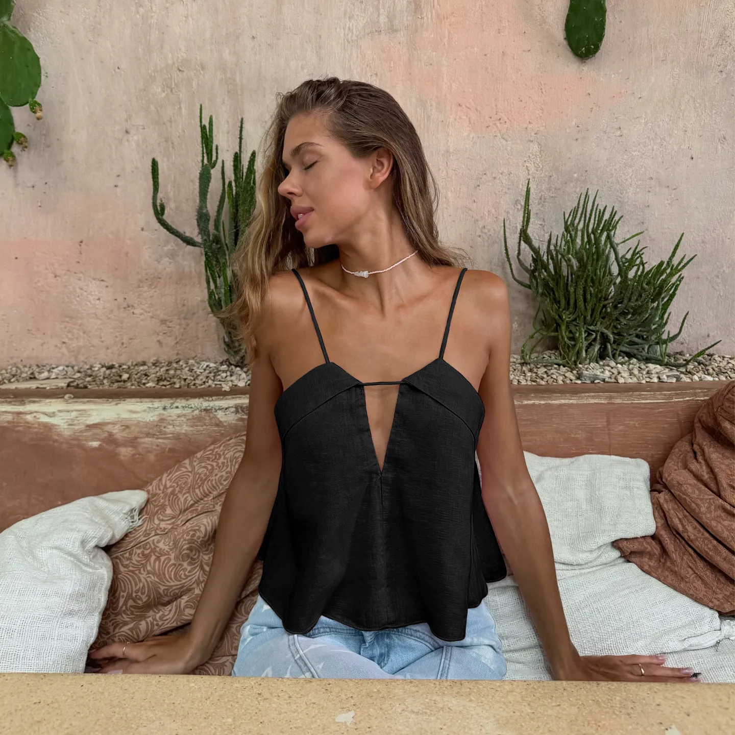
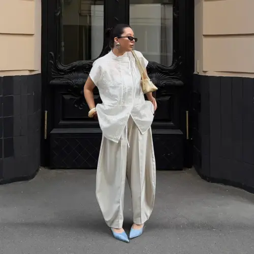
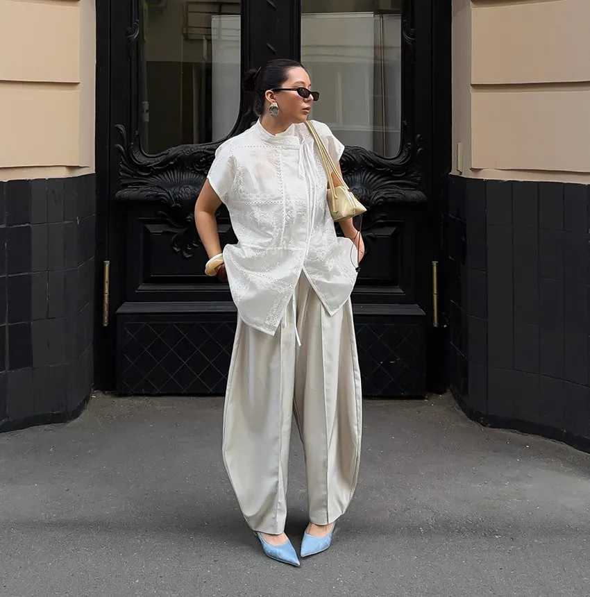
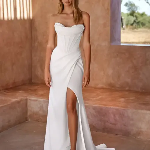
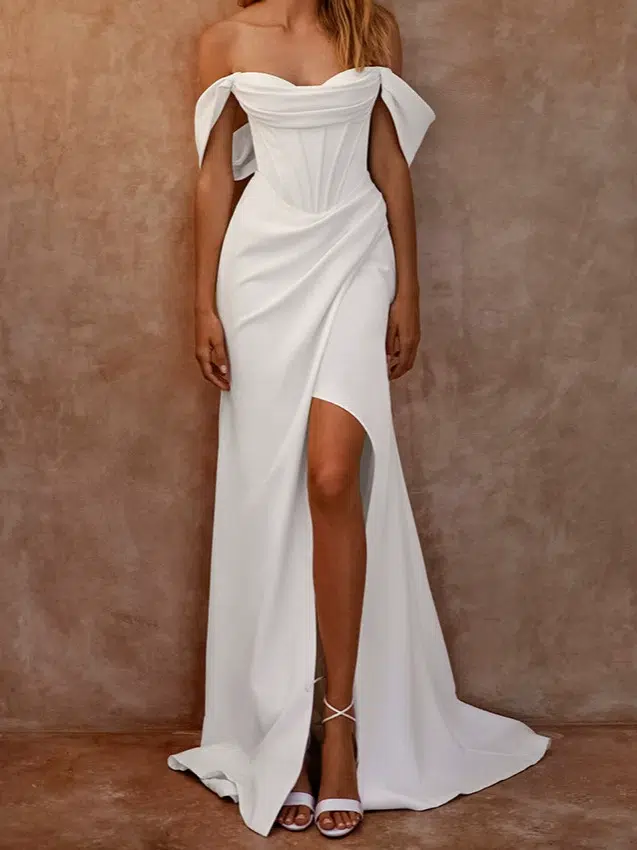
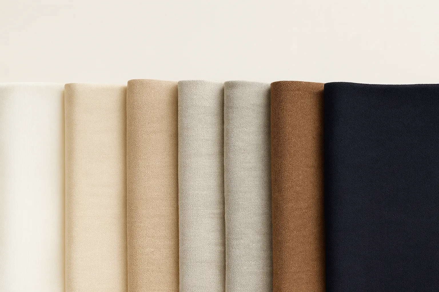
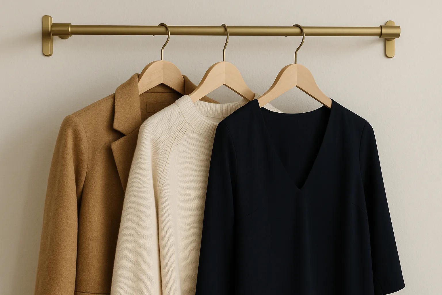
Neutral colours—like white, cream, beige, grey, brown, navy and black—are the wardrobe heroes that mix, match and adapt with ease.

I write this to clear up confusion about neutral colours in clothing. They’re not dull—they’re your most dependable business partners. If you’re sourcing from China and want flexible styles that work in multiple markets, this guide is for you.
What are neutral colours in clothing?
I thought neutral colours meant just black and white. But sourcing for global clients showed me it’s much more than that.
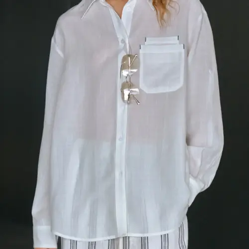
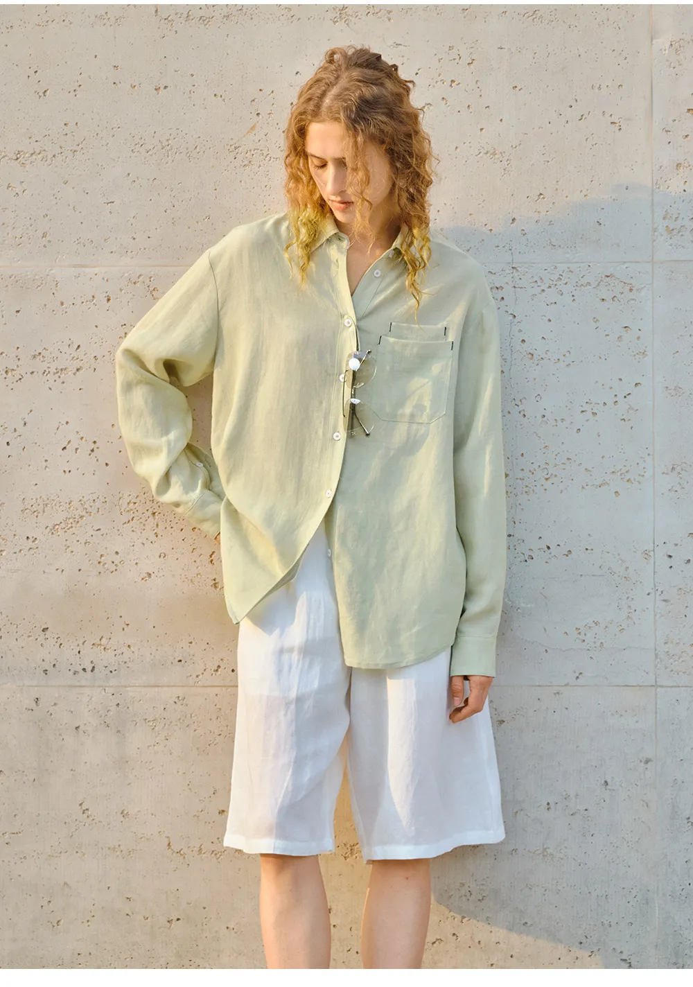
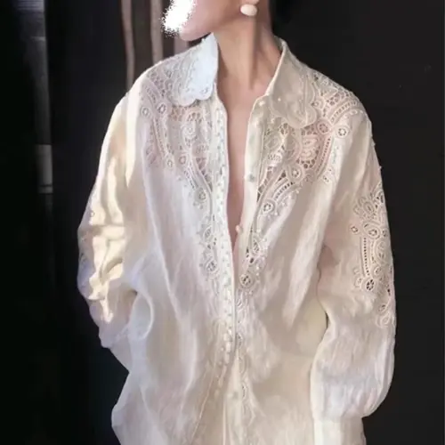
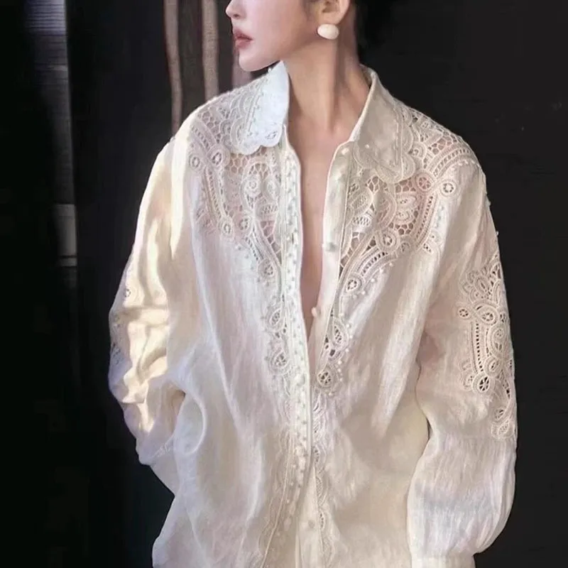
Neutral colours in clothes include white, cream, beige, grey, brown, navy and black. They are base tones that pair well with anything and appeal across markets.
How do they help in custom clothing orders?
| Neutral Colour | Style Use | Market Fit |
|---|---|---|
| Black | Formalwear, basics | US, UK, Global |
| Beige | Spring/Summer tops | Scandinavia, Europe |
| Navy | Outerwear, uniforms | USA, Middle East |
| Grey | Suits, loungewear | Germany, UK |
| White/Cream | Dresses, shirts | Global |
Neutral colours reduce risk. You can use fewer SKUs but serve more buyers. Whether it’s a camel coat or charcoal blazer, neutrals bring confidence.
Why I love all shades of neutral colours?
Clients often ask me what colours to start with. My answer is always: begin with neutrals—they sell first and stay relevant longer.
Neutral shades support any design, adapt to different markets, and lower your MOQ risks.

From my own factory’s experience:
- Neutral T-shirts, sweatshirts and coats sell better.
- A simple change in beige tone can match or break a client’s brand mood.
- Neutrals cost less in marketing because they fit almost any campaign.
Want to build a full custom collection? Start with 3–5 neutrals and add accent colours later. That way, you can adjust based on feedback without redoing everything.
How do you know if a colour is warm, cool or neutral?
One common question from clients is: will this grey match my buyer’s skin tone or brand palette?
Check a colour’s undertone (yellow vs blue), saturation (muted vs vivid), and how it looks next to other items.

Quick chart to check colour temperature
| Question | Warm Colour | Cool Colour | Neutral |
|---|---|---|---|
| Undertone | Yellow, gold | Blue, pink | Balanced/greyed |
| Feels like | Earthy, cozy | Sharp, crisp | Calm, clean |
| Matches with | Fall tones | Winter tones | All seasons |
In manufacturing, we help clients avoid mismatches by offering samples with labelled undertones. This avoids colour return issues and builds long-term trust.
How to style and combine neutral colours in collections?
A buyer from Russia once asked me if she could use only neutrals and still stand out. The answer is yes—if you understand tone and texture.
Mixing neutrals (e.g. camel + cream + navy) creates chic combinations. Stick to similar undertones and varied textures for the best results.
Styling tips from our design room
- Use one dominant neutral: black, navy, or charcoal.
- Add a soft contrast: warm beige, sand, or olive.
- Finish with a clean neutral: cream or white.
Texture matters too. Cotton, wool, and satin look different in the same colour. This allows depth in your designs even when using the same tone.
When we develop custom styles at Truekung, we often start with neutrals for this exact reason. It gives your brand a timeless base and makes production smoother across markets.
Conclusion
Neutral colours are not boring—they’re the foundation of timeless, versatile and globally appealing style.
About me: I’m Lancy Chia at “Truekung” – a China-based bulk factory with 200+ workers, specialising in women’s fashion, outerwear, children’s clothing and accessories for wholesale and OEM/ODM. Want a neutral-based collection with global appeal? Contact me at [email protected] or visit truekung.com.
Views: 548