Every fall season I see buyers lose time and money on the wrong fall colors. The result is slow sales and returns. I fix this by building a clear autumn color palette.
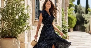
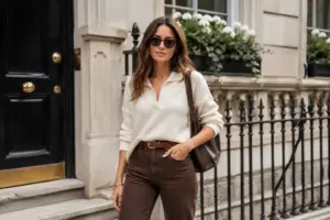
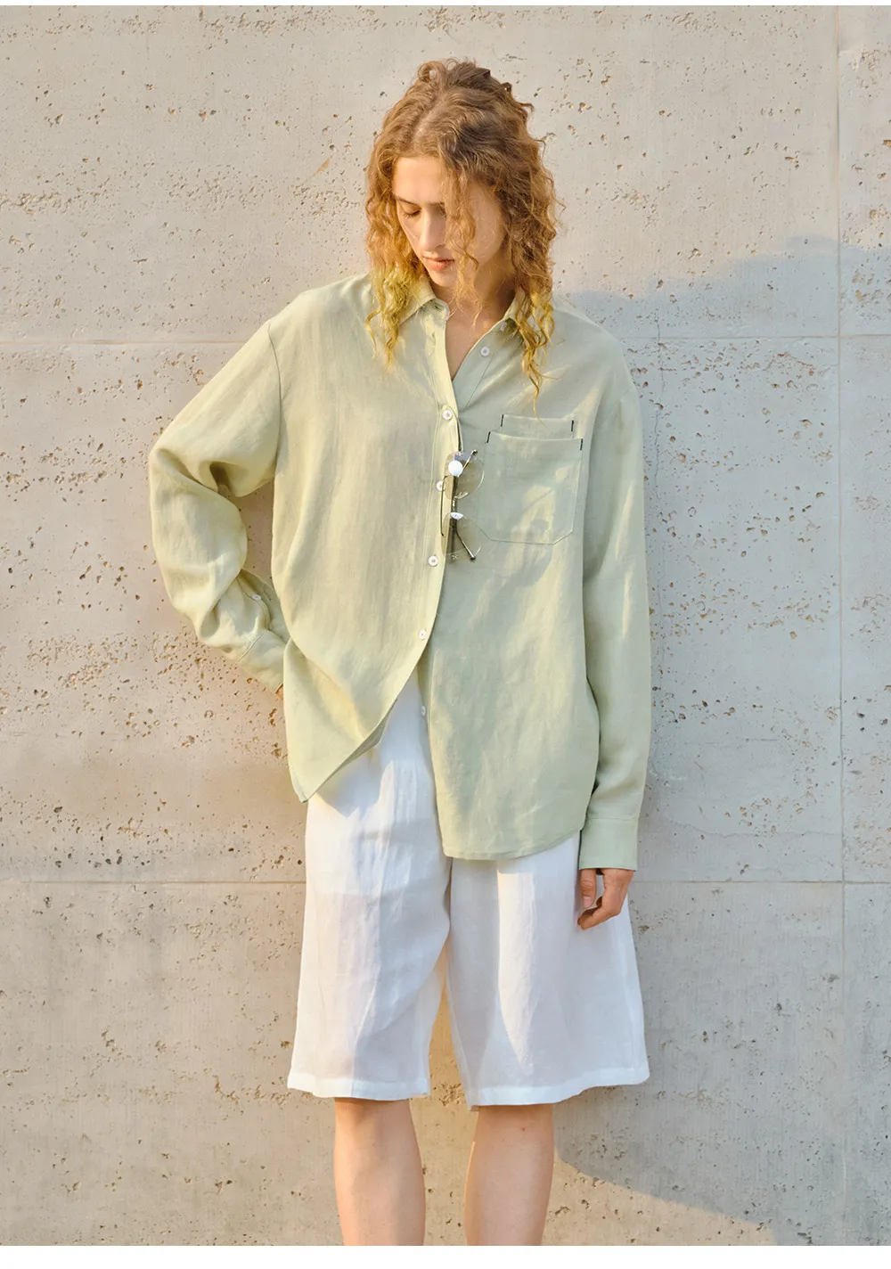
Fall colors are warm, rich, and a little muted. If your skin looks better in gold jewelry than silver, you likely fit a warm autumn color palette. Start with rust, olive, camel, and warm teal, then add deep browns and creamy neutrals for balance.

I still remember a season when a client chose “pretty” colors that looked good on a screen but looked flat on real fabric. The sample room was quiet that day. I do not want that for you, so let me walk you through a warm autumn color palette step by step, and I will end with the fastest way I test a fall colors palette before bulk.
What is considered fall colors, and why do they look so “expensive”?
Fall color can feel confusing because people mix bright autumn colors with deep autumn color palette shades. That mix can make a collection look messy. I have seen it happen.
What is considered fall colors? Warm, earthy, and rich shades that look like the colors of autumn leaves and sunlight. Think rust, pumpkin, mustard, olive, warm navy, chocolate, and cream. They feel grounded, and they make fabrics look higher quality.

The simple rule I use in my factory
When I plan a fall colors palette for a buyer, I start with warmth first. If a shade looks “cold” or “icy,” it is not autumn warm colors. I also check depth. Autumn color schemes can be light-to-medium (soft) or medium-to-deep (deep). If you mix both without control, the story breaks.
A practical autumn color theory checklist
I teach my team one easy check: compare the color next to pure white and next to cream. If it looks better next to cream, it is usually a warm fall colour. Then I compare it next to black and next to chocolate brown. If it looks better next to brown, it fits the colors for autumn.
| Quick check | If the shade fits autumn colors palette | If it does not fit |
|---|---|---|
| White vs cream | Looks softer next to cream | Looks sharper next to white |
| Black vs brown | Looks richer next to brown | Looks cleaner next to black |
| Silver vs gold styling | Gold looks natural | Silver looks natural |
| “Leaf test” | Feels like dried leaves | Feels like winter sky |
How I turn this into a sellable product line
For Maria-like buyers who sell their own brands, I suggest you build a fall palette with roles. You need hero colors, support colors, and neutral anchors. Hero colors are the ones that stop people on a product page. Support colors help you extend sizes and styles without repeating. Neutrals keep margins safe because they sell longer.
I often use this base set for a warm autumn colour palette: rust, cinnamon, mustard, olive, warm teal, chocolate, and cream. Then I add one surprise color like warm aubergine or warm petrol blue. It gives a “new” feeling without leaving the autumn season palette.
Warm autumn vs soft autumn vs deep autumn: how do I choose the right type?
Many buyers ask me about types of autumn color palette groups. They want one chart that solves everything. In real production, the best choice depends on your customer’s contrast, skin tone, and the fabric you use.
Warm autumn is the golden middle: warm, clear, and medium depth. Soft autumn is warmer but more muted and dusty. Deep autumn is warm but darker and heavier, with more depth and drama. If your customers wear gold well, start with warm autumn, then adjust softer or deeper by your market.

Warm autumn vs soft autumn in real clothing
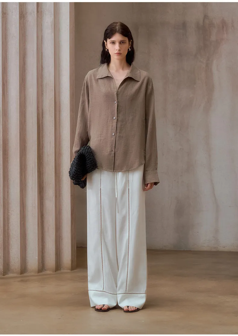
Soft autumn vs deep autumn is not only a color question. It is also a texture question. When I make soft autumn palettes, I use heather yarns, brushed surfaces, and matte dyes. Soft fall color palette shades can look “wrong” if the fabric is shiny. A dusty sage can turn cheap on glossy satin.
Deep autumn vs soft autumn in merchandising
Deep autumn color palette works well for outerwear, leather looks, denim, and heavy knits. Soft autumn works well for drapey tops, casual dresses, and washed cotton. I once helped a buyer who put deep autumn shades into light summer-weight rayon. The samples looked heavy and “sad.” We moved the same colors into brushed twill and the whole set looked premium.
| Autumn group | Best vibe | Strong items | Risk to watch |
|---|---|---|---|
| Warm autumn palette | Golden and lively | knits, shirts, day dresses | too bright can look “spring” |
| Soft autumn palette | Calm and muted | washed tees, soft dresses | too grey can look “tired” |
| Deep autumn palette | Rich and bold | jackets, denim, coats | too dark can reduce repeat buys |
| Bright autumn color palette | Warm and clear | statement tops, prints | can overpower face and skin |
The buyer-friendly way I decide
If your brand sells to women who like clean makeup and simple styling, soft autumn can be safer. If your brand sells confident, high-contrast looks, deep autumn can be the driver. If you want the widest market, warm autumn color palette is the best starting point, then you test one soft option and one deep option in small MOQ.
In wholesale, I also think about returns and reorders. Warm autumn best colors like camel, warm navy, and chocolate brown reorder well across years. Very specific dusty shades can be trendy, but they can also die fast.
Which fall colors match my skin tone, hair, and product positioning?
This is where I see the biggest misunderstanding. People search “autumn skin tone color palette” and hope for a single answer. I use a simple approach: warmth, depth, and contrast. Then I connect it to product design, not only personal styling.
Autumn skin tone color palette usually works when your skin has a warm or golden base. Warm autumn warm colors like rust, olive, warm beige, and teal make the face look alive. If the skin is deeper or hair is dark, warm deep autumn color palette shades like chocolate, aubergine, and deep olive often look best.

How I test “autumn skin color palette” without guessing
When I meet a buyer in a showroom, I do two fast tests with fabric swatches. First, I compare a warm neutral (camel) with a cool neutral (cool grey). Second, I compare a warm red (brick) with a cool red (berry). If camel and brick make the skin look even, that is a strong sign for warm autumn colours.
How this changes product design
If your customers are warm autumn, avoid icy pastels. Instead, use warm fall color palette neutrals and let prints carry the interest. In my production notes, I often set these rules:
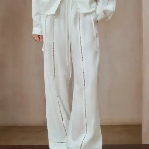
- Use cream instead of pure white for tops.
- Use warm navy or deep teal instead of pure black for dresses.
- Use warm metals, like antique gold, for trims and buttons.
- Use brown-based animal prints instead of black-white zebra.
A factory view: dyes, fabric, and “color of autumn”
Autumnal tones can shift between lab dip and bulk. That is why I focus on process. Some autumn colors palette shades are sensitive, like mustard and warm teal. They can change with fabric composition and finishing.
| Item | What can go wrong | What I do to control it |
|---|---|---|
| Mustard on cotton | turns dull after wash | pre-wash test + lab dip revision |
| Olive on polyester | looks too shiny | choose matte yarn or peached finish |
| Rust on viscose | color migration | set fastness standard + heat test |
| Warm navy on blends | shifts to purple | tighten dye recipe + shade band control |
This is also where Maria’s pain points matter. If you worry about forged certificates, I always suggest third-party testing for color fastness and fiber content. If you worry about delayed delivery, I plan extra time for lab dips on tricky autumn color combinations.
Conclusion
I use a warm autumn color palette to create warm, rich fall colors that sell longer, look premium on fabric, and stay consistent from sample to bulk.
Why I Write This
I am Lancy Chia from Truekung in China. I run a clothing factory with more than 200 workers, and I do B2B wholesale only. I produce fashion clothes and OEM/ODM for brands and supermarkets worldwide. If you want to build a fall colors palette with stable quality and clear timelines, email me at [email protected], or visit https://truekung.com.
Views: 362