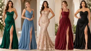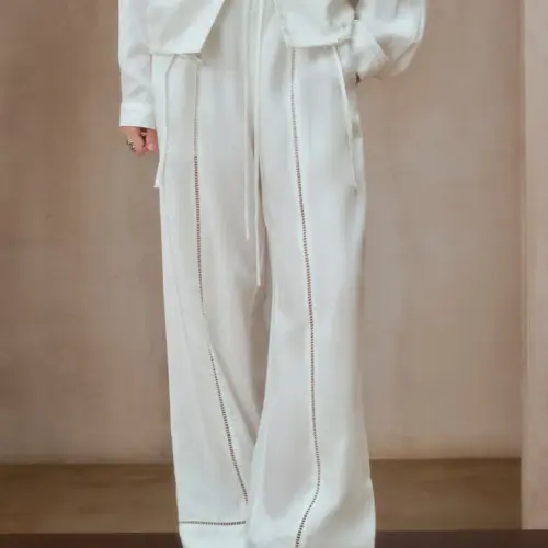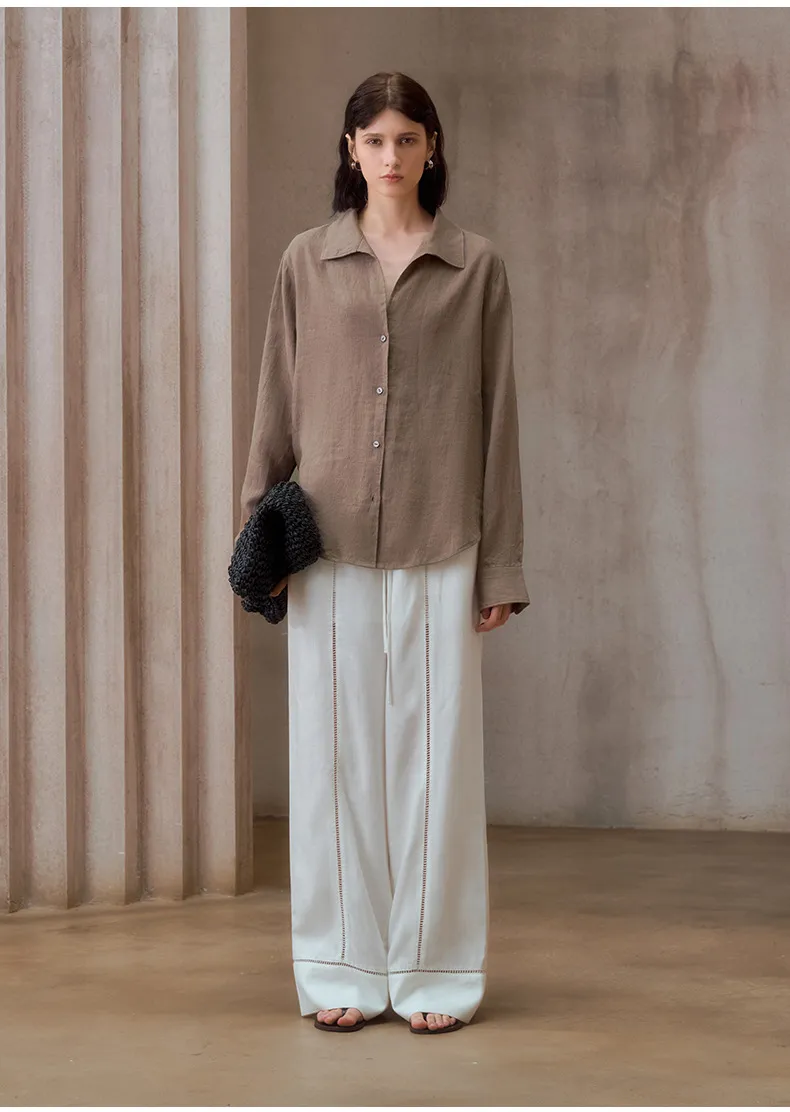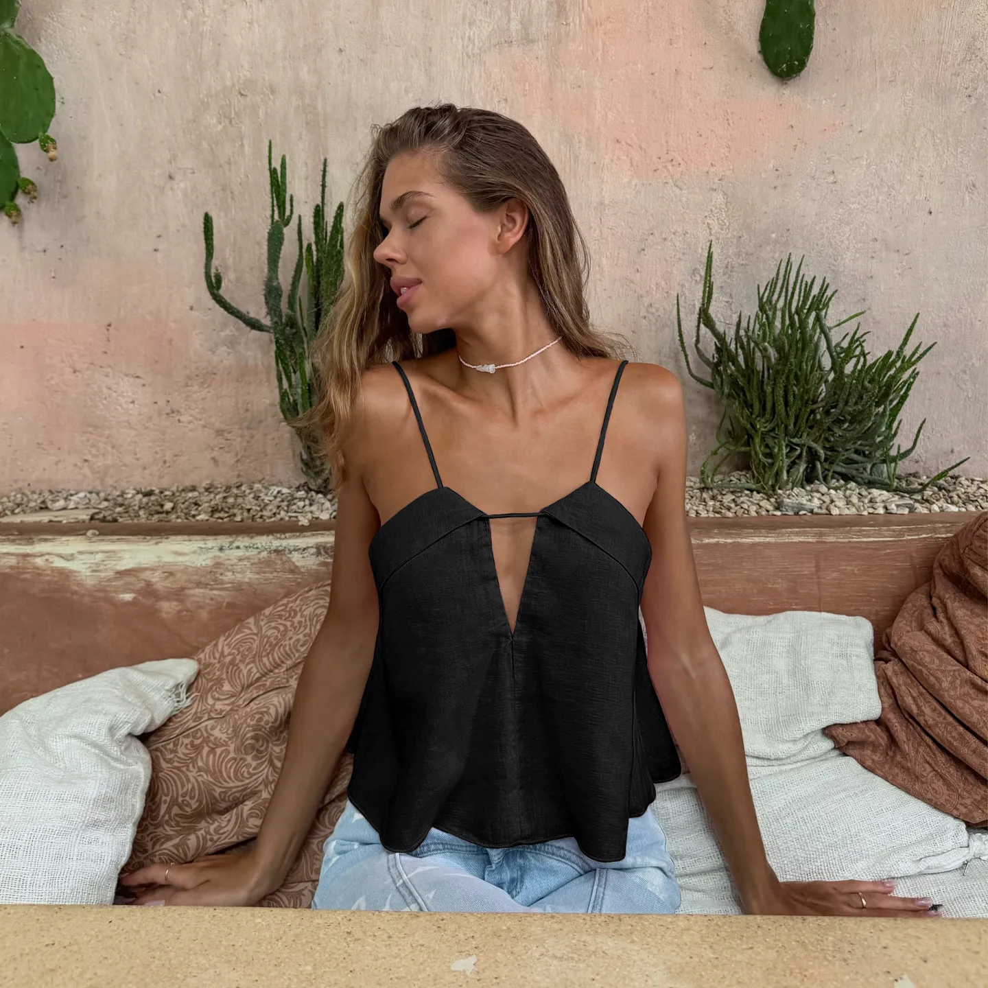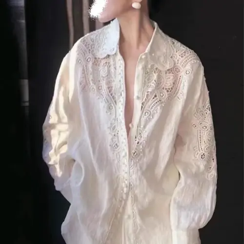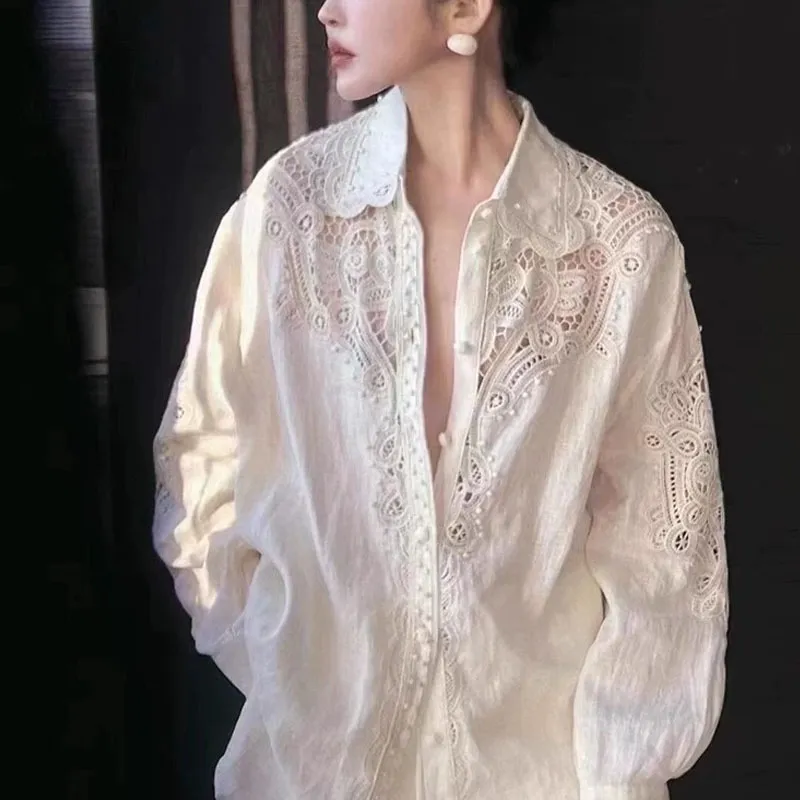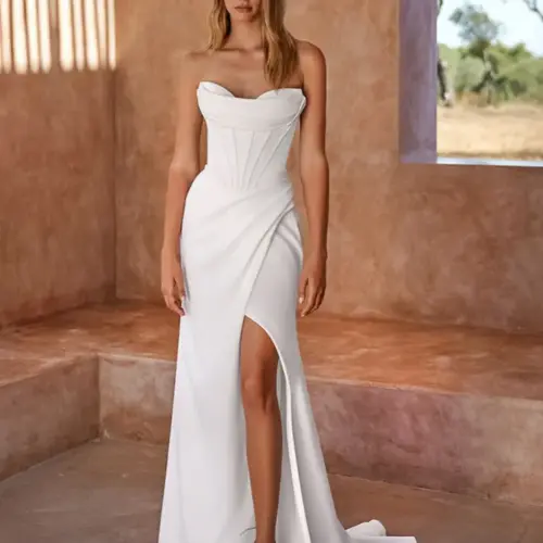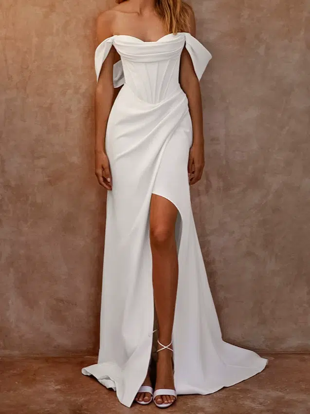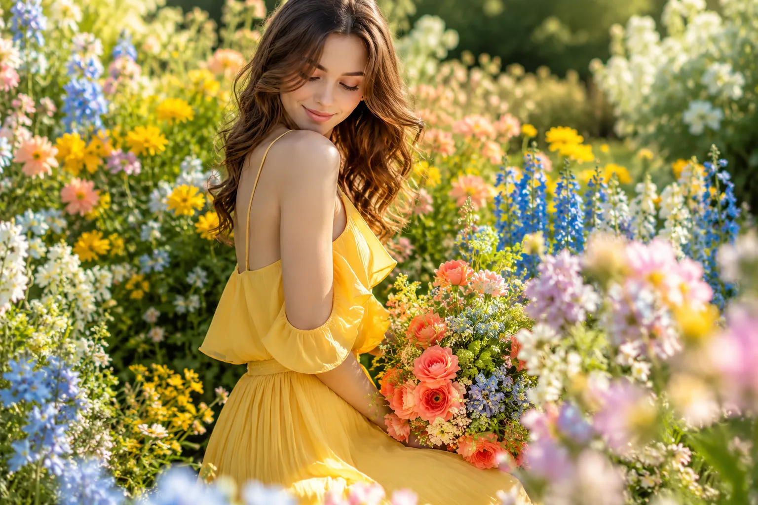

Wiosenne kolory mogą nadać kolekcji świeży i zauważalny charakter. Jednak atrakcyjna paleta barw nie zawsze przekłada się na praktyczną kolekcję ubrań. Niewłaściwy dobór odcieni może zwiększyć liczbę próbek, minimalną ilość zamówienia, koszty produkcji i ryzyko związane z dostawą. Kupujący powinni wziąć pod uwagę zarówno kolor, jak i proces produkcji.
Wiosenna paleta barw zazwyczaj obejmuje świeże, czyste, ciepłe i żywe odcienie, takie jak brzoskwiniowy, koralowy, żółty, świeża zieleń, akwamaryn, turkus, jasnoniebieski i ciepłe barwy neutralne. W przypadku produkcji odzieży, odpowiednie kolory wiosenne powinny również pasować do materiału, docelowego klienta, kategorii produktu, ilości zamówienia i pozycjonowania marki.

Nazywam się Lancy Chia i pochodzę z Truekung. Jesteśmy chińską fabryką odzieży z 20-letnim doświadczeniem w eksporcie i zatrudniamy ponad 200 pracowników. Współpracujemy z zagranicznymi markami, hurtownikami i zespołami zaopatrzeniowymi w zakresie odzieży OEM/ODM, produktów marek własnych, próbek, produkcji hurtowej, kontroli jakości i eksportu.
Z mojego doświadczenia w fabrykach wynika, że kupujący często poświęcają dużo czasu na decydowanie, które kolory będą do siebie pasować. To ważne. Jednak przed rozpoczęciem produkcji masowej muszę również wiedzieć, czy te kolory można pozyskać, ufarbować, dopasować, powtórzyć i wyprodukować w ramach minimalnego zamówienia i planu dostawy klienta.
W tym przewodniku wyjaśnimy, czym są kolory wiosenne, jak stworzyć użyteczną paletę barw na wiosnę, jaki związek z analizą kolorów wiosennych mają produkty modowe oraz co kupujący powinni sprawdzić, zanim wcielą koncepcję kolorystyczną w życie, kupując masową odzież.
Jakie kolory sprawdzą się w kolekcji modowej na wiosnę?
Wiosenna paleta barw powinna być świeża, ale “świeżość” nie oznacza dodania wszystkich pastelowych lub jaskrawych odcieni do jednej kolekcji. Zbyt wiele kolorów może utrudniać sprzedaż i zwiększać koszty produkcji. Użyteczna paleta barw wymaga wyraźnego związku między kolorami bazowymi a akcentami sezonowymi.
Czym są kolory wiosny? Typowe kolory wiosny to brzoskwiniowy, koralowy, ciepły róż, maślany żółty, świeża zieleń, mięta, akwamaryna, turkus, jasny błękit, kremowy, beż i inne czyste lub ciepłe odcienie. Wiosenna paleta barw może łączyć neutralne barwy z jaśniejszymi lub bardziej wyrazistymi kolorami sezonowymi, tworząc zrównoważoną kolekcję modową.
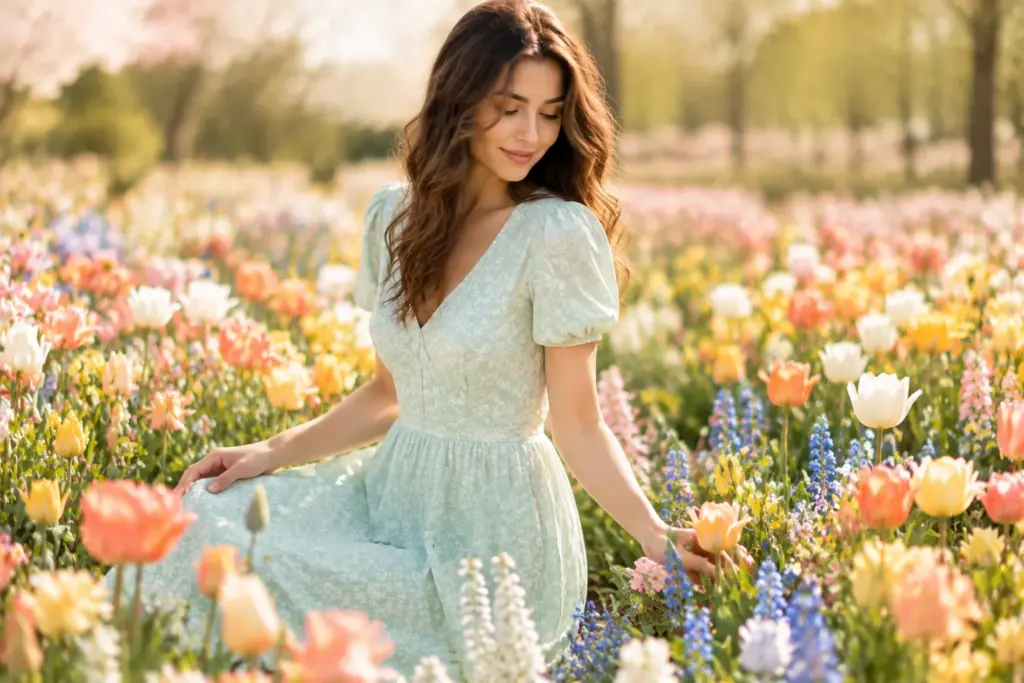
Zacznij od uczucia, a następnie zawęż paletę
Kiedy klient wysyła mi wiosenną tablicę inspiracji, najpierw patrzę na ogólny kierunek kolorystyczny.
Czy kolekcja jest ciepła i naturalna? Czy jest lekka i miękka? Czy jest przejrzysta i energiczna? Czy marka stawia na wyraziste, wiosenne kolory, czy też potrzebuje spokojniejszych barw do codziennej, komercyjnej kolekcji?
Pytania te są istotne, ponieważ nie ma jednej listy, która odpowiadałaby na pytanie “jakie kolory są kolorami wiosny” dla każdej marki odzieżowej.
W kolekcji sukienek damskich można zastosować koral, brzoskwinię, żółć, akwamarynę i kwiatową zieleń. Kolekcja odzieży sportowej lepiej sprawdzi się z mocniejszym turkusem, świeżą zielenią, pomarańczą i czystymi neutralnymi kolorami. Kolekcja kurtek casualowych może bazować na beżu i kremie, z jednym lub dwoma jaśniejszymi kolorami wiosennymi.
Rynek docelowy również ma znaczenie. Kolor, który dobrze sprawdza się w przypadku młodej marki odzieżowej, może nie sprawdzić się równie dobrze w przypadku programu supermarketu lub bardziej konserwatywnego klienta hurtowego.
Zazwyczaj proszę kupujących o podzielenie palety na trzy grupy:
- Podstawowe kolory komercyjne
- Sezonowe kolory uzupełniające
- Mocne kolory akcentowe
Dzięki temu kolekcja jest łatwiejsza do wypromowania i znacznie łatwiej jest zaplanować jej produkcję.
Więcej kolorów może dyskretnie zwiększyć złożoność produkcji
To jest problem, który kupujący czasami zauważają zbyt późno.
Na przykład, klient może zamówić 1200 sztuk jednego stylu. Całkowita ilość wydaje się rozsądna. Ale jeśli ten styl ma sześć kolorów, ilość wynosi tylko 200 sztuk w każdym kolorze.
Dostawcy tkanin często zwracają uwagę na ilość i kolor, zwłaszcza gdy wymagane jest barwienie na zamówienie. W związku z tym fabryka odzieży nie może ocenić zamówienia wyłącznie na podstawie ilości całkowitej.
Dlatego zazwyczaj pytam o ilość sztuk w danym stylu, kolorze, a czasem rozmiarze, zanim potwierdzę, co jest praktyczne.
Ten sam problem występuje również po pozyskaniu materiałów. Więcej kolorów oznacza więcej partii materiałów, identyfikację kroju, pakiety szycia, etykiety, kontrole pakowania, zarządzanie kodami SKU i kontrolę ostatecznej ilości.
| Pytanie dotyczące planowania kolorów | Dlaczego to ma znaczenie | Co sugeruję |
|---|---|---|
| Ile głównych kolorów potrzebujesz? | Zbyt wiele kolorów może podzielić ilość zamówienia | Zacznij od najmocniejszych odcieni komercyjnych |
| Czy każdy odcień jest barwiony na zamówienie? | Niestandardowe kolory mogą mieć wymagania minimalnej ilości zamówienia | Zapytaj o minimalną ilość zamówienia tkaniny przed sfinalizowaniem palety |
| Które kolory są akcentami? | Kolory akcentowe mogą wiązać się z większym ryzykiem sprzedaży | Użyj ich najpierw w wybranych stylach |
| Czy kolory będą się powtarzać w różnych stylach? | Powtarzające się kolory mogą uprościć pozyskiwanie | Używaj popularnych kolorów tam, gdzie ma to sens projektowy |
| Czy dokładne dopasowanie jest ważne? | Różne tkaniny mogą mieć ten sam kolor w różny sposób | Potwierdź kolor na rzeczywistym materiale |
Praktycznym przykładem jest klientka, która chce kupić nową sukienkę w ośmiu kolorach. Brzoskwiniowy, koralowy, miętowy, żółty, turkusowy, jasnoniebieski, kremowy i zielony – wszystkie te kolory mogą pasować do wiosennej kolekcji. Jednak posiadanie wszystkich ośmiu kolorów nie czyni kolekcji automatycznie atrakcyjniejszą.
Jeśli łączna wielkość zamówienia jest ograniczona, mogę zasugerować wybór czterech ważnych kolorów. Kupujący może przeznaczyć większą ilość na sprawdzone odcienie, a pozostałe kolory wykorzystać do późniejszych zamówień, nadruków, wykończeń lub innych stylów. Daje to marce wystarczającą różnorodność sezonową bez nadmiernego dzielenia ilości materiału.
Istnieje tu pewien kompromis. Większa paleta wiosennych kolorów daje kupującym większy wybór wizualny, ale jednocześnie zwiększa złożoność zapasów i zaopatrzenia. Mniejsza paleta może poprawić efektywność zakupów, ale wymaga dobrej koordynacji kolorystycznej, aby kolekcja nie wyglądała na powtarzalną. Sugeruję, aby oceniać każdy dodatkowy kolor pod kątem jego roli komercyjnej. Jeśli dwa odcienie zaspokajają niemal te same potrzeby klientów, jeden może wystarczyć na pierwsze zamówienie hurtowe. Ta decyzja jest szczególnie przydatna dla nowych marek, które nie dysponują jeszcze wiarygodnymi danymi sprzedażowymi.
Dlaczego ten sam kolor wiosny może wyglądać inaczej na różnych tkaninach?
Kolor może wyglądać idealnie na ekranie, ale rozczarowująco na finalnym ubraniu. Nie zawsze oznacza to, że ktoś wybrał zły kolor. Skład włókien, konstrukcja tkaniny, faktura powierzchni, wykończenie i oświetlenie mogą wpłynąć na to, jak prezentuje się wiosenny kolor.
Ten sam kolor wiosenny może wyglądać inaczej, ponieważ tkaniny inaczej pochłaniają i odbijają barwy. Bawełniany jersey, len, satyna, polar, denim i poliester mogą dawać różne efekty wizualne, nawet przy podobnym kierunku kolorów. Kupujący powinni zatwierdzić kolory wiosenne na materiale, z którego są wykonane, zawsze, gdy ważna jest dokładność odwzorowania kolorów.

“Miętowa zieleń” nie jest standardem produkcyjnym
Nazwy kolorów są przydatne podczas omawiania pomysłów. Nie wystarczą, gdy musimy produkować ubrania na masową skalę.
Kupujący może mi powiedzieć: “Chcę miętę”.”
Rozumiem ogólny kierunek, ale która mennica?
Jedna mięta może być bardzo blada. Inna może mieć więcej niebieskiego. Jeszcze inna może mieć więcej żółtego. Niektórzy kupujący oczekują łagodnej, wiosennej palety barw, podczas gdy inni wyobrażają sobie znacznie czystszą i jaśniejszą miętę.
Ten sam problem dotyczy kolorów koralowego, brzoskwiniowego, akwamarynowego, jasnoniebieskiego, kremowego i wielu innych wiosennych kolorów.
Zazwyczaj proszę kupujących o podanie nazwy koloru, gdy zależy mi na dokładnym dopasowaniu. Fizyczny próbnik również może być przydatny.
Następnie musimy sprawdzić, jak to odniesienie zachowuje się na wybranym materiale.
Gładka powierzchnia poliestrowa może sprawić, że jasny, wiosenny kolor będzie wyglądał czysto i intensywnie. Tekstura lnu może sprawić, że podobny kolor będzie wyglądał bardziej naturalnie i lekko stonowany. Szczotkowana tkanina bluzy tworzy inny efekt wizualny. Pranie odzieży może ponownie zmienić efekt.
Dlatego wyboru koloru i wyboru materiału nie należy traktować jako dwóch zupełnie odrębnych decyzji.
Zatwierdzenie Pantone to tylko część procesu
W przypadku tkanin barwionych na zamówienie, zatwierdzenie koloru może wiązać się z zanurzeniem w roztworze laboratoryjnym przed rozpoczęciem masowej produkcji.
Kupujący może porównać proponowane odcienie i zatwierdzić najbardziej odpowiednią opcję przed rozpoczęciem produkcji. Kupujący powinien jednak pamiętać, że zatwierdzony kolor musi być powiązany z odpowiednią tkaniną i procesem produkcyjnym.
Widziałem, jak kupujący tracili czas, ponieważ zespół projektowy najpierw zatwierdzał cyfrowy kolor, a dopiero później zmieniał materiał. Kolor wymagał ponownej weryfikacji, ponieważ ostateczny materiał nie oddawał odcienia w dokładnie taki sam sposób.
Kolejnym problemem jest dopasowywanie różnych materiałów w jednym ubraniu.
Wyobraź sobie bluzę z:
- Główny materiał polarowy
- Ściągacze przy mankietach i pasie
- Nici do haftu
- Sznurek ściągający
- Zamek błyskawiczny lub inne akcesoria
Kupujący może chcieć wszystkie w jednym, jasnym, wiosennym kolorze. Jednak materiały te niekoniecznie mają ten sam skład włókien ani proces barwienia.
Mogą być do siebie podobne, choć nie muszą wyglądać identycznie.
Co sprawdzam przed zatwierdzeniem koloru hurtowego
| Przedmiot | Główne ryzyko | Sugerowane działanie |
|---|---|---|
| Główny materiał | Cień nie odpowiada oczekiwaniom projektowym | Zatwierdź kolor na rzeczywistym materiale |
| Tkanina prążkowana lub kontrastowa | Różna kompozycja tworzy widoczną różnicę odcieni | Przejrzyj to razem z materiałem korpusu |
| Kolory wykończeń | Zamki błyskawiczne, guziki, sznurki i nici mogą nie być idealnie dopasowane | Określ akceptowalne wymagania dotyczące dopasowania |
| Pranie odzieży | Pranie może zmienić intensywność koloru | Sprawdź po zamierzonym procesie prania |
| Tkanina luzem | Partia hurtowa może różnić się od materiału w fazie rozwoju | Przed cięciem należy sprawdzić odcień |
| Oświetlenie | Kolory wyglądają inaczej w różnym świetle | Stosuj spójne warunki zatwierdzania |
| Powtórz zamówienie | Nowe partie barwników mogą wykazywać różnice | Zachowaj zatwierdzone odniesienie do przyszłych porównań |
Staje się to szczególnie ważne w przypadku wiosennych, jaskrawych kolorów. Niewielka różnica może być bardziej widoczna, na przykład, gdy projekt wykorzystuje czysty turkusowy korpus z pasującym ściągaczem.
Załóżmy, że materiał korpusu to polar z dużą zawartością bawełny, ale ściągacz zawiera inną mieszankę włókien. Zakład może dążyć do uzyskania tego samego koloru wiosennego, ale oba materiały mogą reagować inaczej. Kupujący musi wówczas zdecydować, czy niewielka różnica wizualna jest akceptowalna, czy też konieczne jest bliższe dopasowanie do projektu. Bliższe dopasowanie może wymagać dodatkowych prac rozwojowych, alternatywnych materiałów lub dłuższego czasu na próbkowanie.
Moja zasada decyzyjna jest prosta: Jeśli dwa materiały muszą mieć ten sam kolor na gotowym ubraniu, należy je zatwierdzić obok siebie przed rozpoczęciem produkcji masowej.
Nie należy zakładać, że jeden zatwierdzony numer koloru gwarantuje identyczny efekt wizualny w przypadku każdego materiału.
Wydaje się to mało istotne, ale może mieć wpływ na dostawę. Jeśli kupujący odrzuci kolor dopiero po dostarczeniu materiału, usunięcie problemu okaże się znacznie droższe niż jego zidentyfikowanie na etapie projektowania.
W jaki sposób kupujący powinni wykorzystywać analizę kolorów wiosną w przypadku odzieży komercyjnej?
Wiosenna analiza kolorystyczna jest przydatna do określenia kierunku kolorystycznego, szczególnie dla marek, które projektują swoje produkty w oparciu o indywidualne pory roku. Jednak paleta barw dla wiosennego odcienia skóry i paleta kolorów odzieży komercyjnej to nie to samo. Fabryka nadal potrzebuje szczegółowych informacji o produkcji.
Analiza kolorystyczna wiosny zazwyczaj koncentruje się na świeżych, czystych, żywych i często ciepłych barwach. Wiosenna paleta barw może obejmować brzoskwinię, koral, złotą żółć, świeżą zieleń, turkus, akwamarynę i ciepłe barwy neutralne. Marki mogą wykorzystać ten kierunek rozwoju produktu, ale ostateczne kolory powinny również uwzględniać popyt klientów, zachowanie się tkanin, minimalne zamówienie (MOQ) i wykonalność produkcji.

Miękkie, ciepłe i jasne palety wiosenne odpowiadają potrzebom różnych klientów
Kupujący poszukujący palety barw na wiosnę znajdą wiele wariantów.
Niektórzy preferują łagodną, wiosenną paletę barw z jaśniejszymi, delikatniejszymi odcieniami. Inni szukają ciepłej, wiosennej palety barw, zbudowanej wokół brzoskwini, ciepłej żółci, koralu i świeżych zieleni. Jasna, wiosenna paleta barw może obejmować mocniejsze odcienie akwamaryny, turkusu, zieleni, różu lub pomarańczu.
Czy pomarańczowy to kolor wiosenny?
Może być. Czysty, ciepły pomarańcz lub koralowo-pomarańczowy może bardzo dobrze pasować do wiosennej palety barw.
Czy jasnoniebieski to kolor wiosenny?
To również może się sprawdzić, zwłaszcza jeśli odcień jest świeży i pasuje do reszty kolekcji.
Dlatego nie wybierałbym kolorów tylko dlatego, że tabela oznacza je jako kolory wiosenne. Zadałbym bardziej praktyczne pytanie:
Czy ten kolor będzie odpowiedni dla tego produktu, klienta i przedziału cenowego?
Jaskrawopomarańczowy top sportowy i jaskrawopomarańczowy długi płaszcz stwarzają zupełnie inne ryzyko handlowe. Kolor może być ten sam, ale zobowiązanie wobec produktu nie.
Wykorzystaj swoje dane sprzedażowe przed skorzystaniem z tabeli kolorów
Jeśli marka ma już historię sprzedaży, uważam, że taka informacja jest bardziej przydatna niż ślepe podążanie za ogólną paletą kolorów na sezon wiosenny.
Sprawdź, które kolory sprzedają się dobrze w podobnych produktach.
Jeśli kremowy, jasnoniebieski i koralowy cieszyły się wcześniej dużym powodzeniem, te kolory mogą stać się częścią nowej palety. Wtedy marka może przetestować jeden lub dwa nowe, wiosenne odcienie zamiast zmieniać całą gamę.
W przypadku nowej marki, która nie dysponuje danymi sprzedażowymi, sugeruję stosowanie większej ilości elastycznych kolorów i bardziej selektywne stosowanie mocniejszych odcieni.
Na przykład:
| Produkt | Kierunek Bezpieczniejszy Rdzeń | Możliwy akcent wiosenny |
|---|---|---|
| Koszulka | Kremowy, jasno neutralny, jasnoniebieski | Koralowy lub świeży zielony |
| Sukienka | Brzoskwiniowy, niebieski, ciepły neutralny | Żółty lub turkusowy |
| Podkoszulek | Kremowy, neutralny w odcieniu szarości, niebieski | Aqua lub jasnozielony |
| Lekka kurtka | Beżowy, kremowy, jasny khaki | Koralowy lub świeży niebieski |
| Odzież sportowa | W razie potrzeby czarna/neutralna baza | Turkusowy, pomarańczowy, zielony |
| Spódnica | Kremowy, beżowy, odcień dżinsu | Brzoskwiniowy lub wiosenny zielony |
To nie są sztywne zasady. Rynek docelowy i pozycjonowanie marki zawsze powinny być najważniejsze.
Kupujący sprzedający produkty modowe do różnych krajów może również potrzebować różnych przydziałów kolorów. Fabryka może pomóc w ocenie wykonalności produkcji, ale zazwyczaj kupujący lepiej niż my rozumie preferencje klientów i historię sprzedaży.
Piękna paleta wciąż potrzebuje planu produkcyjnego
W tym miejscu analiza kolorów wiosny staje się praktycznym sposobem pozyskiwania składników odżywczych.
Wyobraź sobie kupującego projektującego koszulki, sukienki, spódnice i lekkie kurtki. Zespół projektantów tworzy piękną, jasną, wiosenną paletę kolorów z ośmioma dopasowanymi odcieniami.
Gdyby każdy produkt występował w każdym kolorze, liczba SKU mogłaby bardzo szybko wzrosnąć.
Każda kombinacja stylu, koloru i rozmiaru tworzy zapasy, które należy produkować i kontrolować. W przypadku zamówień marek własnych musimy również wziąć pod uwagę etykiety, opakowanie, identyfikację kartonów i alokację ilościową.
Kupujący musi zatem znaleźć równowagę między różnorodnością wizualną a wydajnością produkcji.
Proponuję wybrać dwa lub trzy kolory, które sprawdzą się w różnych stylach. Następnie należy używać mocniejszych kolorów tylko tam, gdzie rzeczywiście dodają wartości. W ten sposób powstanie rozpoznawalna, wiosenna paleta barw, a zakupy i zarządzanie zapasami tkanin będą łatwiejsze.
Istnieje jeszcze jeden kompromis związany z ceną docelową. Tkaniny barwione na zamówienie, niewielkie ilości kolorów, specjalne pranie i specjalnie dopasowane wykończenia – to wszystko może wpłynąć na koszt. Jeśli kupujący ma ściśle określoną cenę docelową, możemy omówić wybór tkaniny standardowej, mniejszą liczbę kolorów, alternatywną konstrukcję tkaniny lub inne rozwiązania wykończenia. Żadna z tych opcji nie jest automatycznie lepsza. Właściwa decyzja zależy od tego, co jest najważniejsze dla danej kolekcji: dokładny kolor, personalizacja, minimalne zamówienie (MOQ), cena lub czas dostawy.
Dla mnie paleta barw wiosennych jest gotowa do produkcji dopiero wtedy, gdy nabywca może powiązać każdy istotny kolor z tkaniną, stylem, ilością, wymaganiami jakościowymi i planem dostawy.
Które kolory wiosenne należy wprowadzić do masowej produkcji w pierwszej kolejności?
Wybór koloru staje się trudniejszy, gdy kupujący przechodzi od pobierania próbek do składania zamówienia. W niektórych projektach możliwe jest pobranie dziesięciu kolorów, ale zamówienie dziesięciu kolorów w celach komercyjnych wiąże się z ryzykiem braku zapasów. Kupujący potrzebują jasnej zasady, która pozwoli im zdecydować, które kolory zasługują na większą ilość.
Przy pierwszym zamówieniu hurtowym sugeruję, aby wybrać większą ilość sprawdzonych lub uniwersalnych kolorów wiosennych i selektywnie wybierać mocniejsze, modne odcienie. Podstawowe kolory neutralne, takie jak jasnoniebieski, brzoskwiniowy, świeża zieleń lub inne odcienie pasujące do marki, mogą uzupełniać kolekcję, natomiast jaśniejsze kolory można przetestować na mniejszej liczbie modeli, jeśli popyt na nie jest pewny.
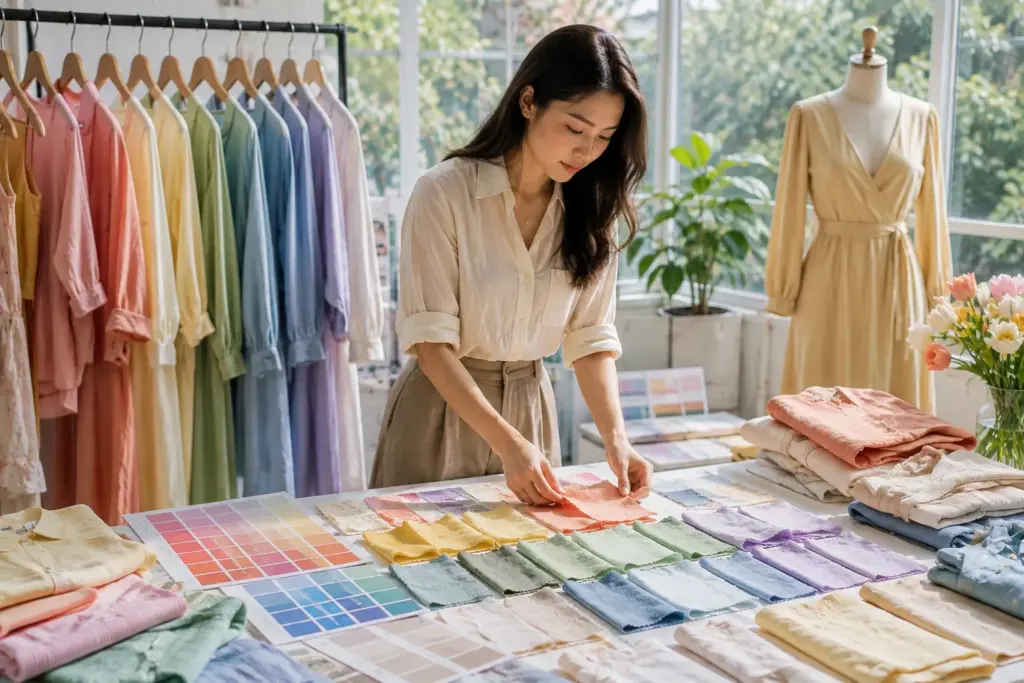
Myśl w kategoriach jednostek magazynowych (SKU), a nie tylko całych elementów
Jednym z błędów przy ustalaniu źródeł zaopatrzenia jest patrzenie tylko na całkowitą ilość zamówienia.
Na przykład 5000 sztuk może wydawać się sporym zamówieniem. Sytuacja produkcyjna ulega jednak zmianie, jeśli te 5000 sztuk zostanie podzielone na wiele stylów, kolorów i rozmiarów.
Poważny dostawca odzieży powinien to wyjaśnić zanim potwierdzi nierealistyczny plan kolorystyczny.
Zwykle chcę zobaczyć:
- Ilość na styl
- Ilość na kolor
- Podział wielkości
- Materiał używany w każdym stylu
- Które style mają ten sam materiał
- Które kolory powtarzają się w różnych produktach
- Niezależnie od tego, czy tkanina jest dostępna w magazynie, czy też jest wykonywana na zamówienie
Mając te informacje, możemy omówić, w jakich sytuacjach pomocne może być ujednolicenie kolorów.
Jeśli na przykład trzy style koszulek wykorzystują tę samą bawełnianą dzianinę i ten sam wiosenny zielony kolor, można zaplanować materiał bardziej efektywnie niż w przypadku, gdy każdy styl ma inną zieleń.
Sprawdź wydajność kolorów przed zakupem większej ilości
Dobór kolorów powinien również uwzględniać kontrolę jakości.
Bardzo jasne kolory wiosenne mogą łatwiej plamić się lub pozostawiać ślady użytkowania. Intensywne kolory mogą wymagać uwagi pod kątem trwałości koloru, w zależności od tkaniny i wymagań produktu. Produkty po praniu wymagają oceny.
Przed rozpoczęciem produkcji kupujący powinien poinformować dostawcę o wymaganych normach testowych i wymaganiach rynku.
Certyfikaty należy traktować w ten sam praktyczny sposób. Jeśli Twój rynek, sprzedawca detaliczny lub firma wymaga konkretnego certyfikatu, powiedz dostawcy dokładnie, czego potrzebujesz i poproś o odpowiednie, ważne dokumenty. Nie polegaj tylko na tym, że dostawca zapewnia: “mamy certyfikaty”.”
Zazwyczaj proszę kupujących o sprawdzenie faktycznych wymagań, ponieważ różne produkty, rynki i klienci mogą wymagać różnej dokumentacji.
Moja zasada dodawania kolejnego wiosennego koloru
Zanim dodasz kolejny kolor do zamówienia hurtowego, zapytaj:
Czy kolor ten przedstawia wystarczającą wartość komercyjną, aby uzasadnić kolejne zobowiązanie dotyczące produkcji i zapasów?
Jeśli odpowiedź brzmi tak, dodaj ją.
Jeśli nie masz pewności co do odpowiedzi, rozważ przetestowanie produktu w mniejszej liczbie produktów lub zmniejsz częstotliwość nakładania się z innym podobnym odcieniem.
Na przykład, jeśli kolekcja zawiera już brzoskwiniowy i koralowy, czy potrzebuje również nieco innego, ciepłego różu? Być może dlatego, że klient docelowy chętnie kupuje ten odcień. Ale jeśli nie ma to celu sprzedażowego, trzeci podobny kolor może jedynie podzielić ilość.
To samo dotyczy mięty, akwamaryny, turkusu i jasnego błękitu. Wszystkie te kolory mogą należeć do palety wiosennej, ale użycie ich wszystkich naraz nie oznacza automatycznie, że są lepsze.
Z mojego doświadczenia w fabrykach wynika, że klienci lepiej radzą sobie z produkcją, gdy pokazują nam, które kolory są niezbędne, a które elastyczne. Jeśli podstawowy koral wymaga indywidualnego barwienia, a drugi, jasnoniebieski, może być wykonany z dostępnej tkaniny, możemy omówić koszty i różnicę w czasie realizacji. Kupujący może wtedy podjąć decyzję handlową, zamiast otrzymywać proste “tak” lub “nie” z fabryki.
Planowanie kolorów nie polega zatem tylko na tym, jakie kolory reprezentują wiosnę. Chodzi o to, aby zdecydować, jakie miejsce każdy kolor zajmie w kolekcji.
Co należy przygotować przed skontaktowaniem się z chińską fabryką odzieży?
Jeśli posiadasz już paletę kolorów wiosennych, nie musisz przygotowywać idealnego pliku produkcyjnego przed kontaktem z fabryką. Jednak jasne, podstawowe informacje pomogą nam przedstawić dokładniejszą wycenę, harmonogram i sugestię rozwoju.
| Informacje do przygotowania | Przykład | Dlaczego fabryka tego potrzebuje |
|---|---|---|
| Kategoria produktu | Sukienka, koszulka, kurtka, spódnica, odzież sportowa | Różne produkty wymagają różnych procesów produkcyjnych |
| Zdjęcia referencyjne lub pakiet techniczny | Szkice, zdjęcia, arkusz pomiarowy | Pomaga nam zrozumieć konstrukcję i styl |
| Tkanina | Koszulka bawełniana, mieszanka lnu, tkanina poliestrowa | Materiał wpływa na cenę, minimalną ilość zamówienia, kolor i wydajność |
| Odniesienia kolorystyczne | Odniesienia Pantone lub fizyczne próbki | Zmniejsza subiektywną komunikację kolorystyczną |
| Zakres rozmiarów | XS-XL lub tabela rozmiarów niestandardowych | Potrzebne do oceny wzorców i stopniowania |
| Ilość na styl/kolor | 800 szt. z podziałem na cztery kolory | Ważne dla pozyskiwania tkanin i minimalnego zamówienia |
| Rynek docelowy | USA, UE, Australia, program dla sprzedawców detalicznych | Może mieć wpływ na rozmiary, etykietowanie, testowanie i zgodność |
| Poziom jakości | Hurtowa sprzedaż produktów markowych podstawowych lub o wyższym poziomie szczegółowości | Materiał i wykonanie mają wpływ na wycenę |
| Opakowanie | Wymagania dotyczące torebek foliowych, wieszaków i kartonów | Opakowanie wpływa na koszty i planowanie produkcji |
| Etykietowanie | Główna etykieta, metka z instrukcją pielęgnacji, metka z rozmiarem, zawieszka | Potrzebne do rozwoju marek własnych |
| Termin dostawy | Wymagana data wysyłki | Pomaga nam ocenić czas produkcji |
| Certyfikaty | Konkretny certyfikat wymagany przez Twojego kupującego lub rynek | Musimy potwierdzić dokładne wymagania |
| Wymagania testowe | Trwałość koloru lub testy specyficzne dla kupującego | Testowanie może mieć wpływ na rozwój, koszty i czas |
| Cena docelowa, jeśli dostępna | Zakres cen docelowych FOB | Pomaga nam proponować realistyczne opcje tkanin i konstrukcji |
Widziałem kupujących, którzy tracili czas, wysyłając tylko jedno zdjęcie referencyjne i prosząc o cenę. Problem nie polega na tym, że fabryka nie chce podać wyceny. Problem polega na tym, że materiał, konstrukcja, ilość, kolor, opakowanie i poziom jakości mogą znacząco wpłynąć na cenę.
Przejrzyste badanie pozwala nam zidentyfikować te zmienne wcześniej.
Możesz również poinformować fabrykę, które szczegóły są stałe, a które elastyczne. Na przykład, możesz powiedzieć, że kolor sprężyny jest stały, ale skład materiału można dostosować, aby osiągnąć cenę docelową. Możesz też powiedzieć, że materiał jest stały, ale możesz zmniejszyć liczbę kolorów, jeśli minimalne zamówienie stanie się problemem.
Informacje te sprawiają, że komunikacja staje się o wiele bardziej użyteczna.
Kiedy należy zwrócić się do Truekunga z prośbą o wycenę?
Możesz skontaktować się z firmą Truekung, jeśli dysponujesz pakietem technicznym, próbką referencyjną, zdjęciami produktów lub w miarę jasną koncepcją odzieży i chcesz dowiedzieć się, jak można ją wdrożyć w fazie próbkowania i produkcji masowej.
Truekung współpracuje z zagranicznymi klientami, którzy potrzebują produkcji odzieży OEM/ODM, produktów modowych pod markami własnymi, opracowywania próbek, produkcji masowej, kontroli jakości, stabilnej komunikacji eksportowej i praktycznego wsparcia fabrycznego.
Produkujemy odzież damską, kurtki, sukienki, spódnice, dżinsy, koszulki, bluzy, kurtki puchowe, płaszcze, odzież sportową, odzież dziecięcą, bieliznę, torby i inne produkty modowe.
W przypadku kolekcji wiosennej możesz przesłać mi informacje o swoich produktach, wymaganiach dotyczących tkanin, wiosennej palecie kolorów, ilości sztuk w danym stylu i kolorze, zakresie rozmiarów, rynku docelowym, wymaganiach dotyczących opakowania, docelowym terminie dostawy oraz wszelkie wymagane certyfikaty lub standardy testowe.
Adres e-mail: [email protected]
Strona internetowa: https://truekung.com
Wolę poznać te szczegóły, zanim przedstawię sugestie dotyczące produkcji. Przydatna wycena powinna pomóc Ci zrozumieć, co jest realne w przypadku Twojego produktu, a nie tylko podać Ci konkretną kwotę.
Wniosek
Dobra paleta kolorów na wiosnę to coś więcej niż tylko atrakcyjne kolory. Powinna pasować do klienta, materiału, minimalnego zamówienia (MOQ), ceny i planu produkcji. Sugeruję wczesne potwierdzenie standardów kolorystycznych, kontrolę zbędnych SKU i zatwierdzenie ważnych odcieni na materiale przed rozpoczęciem produkcji masowej.
Widoki: 109