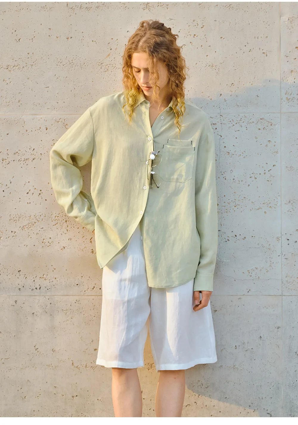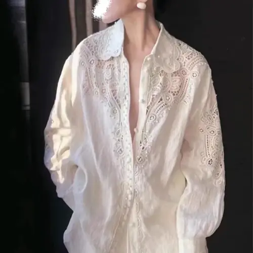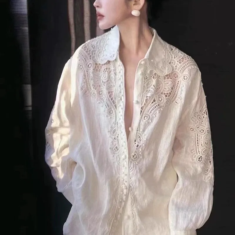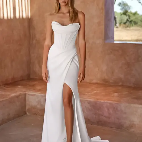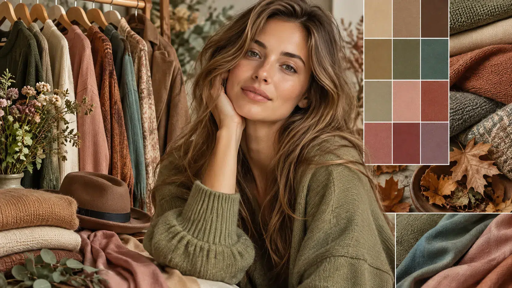

Soft Autumn colours can look simple, but choosing the wrong brown, green, beige, or red can make an entire clothing range feel too bright or too heavy. The solution is to understand the soft autumn color palette before selecting fabrics, trims, prints, and garment combinations.
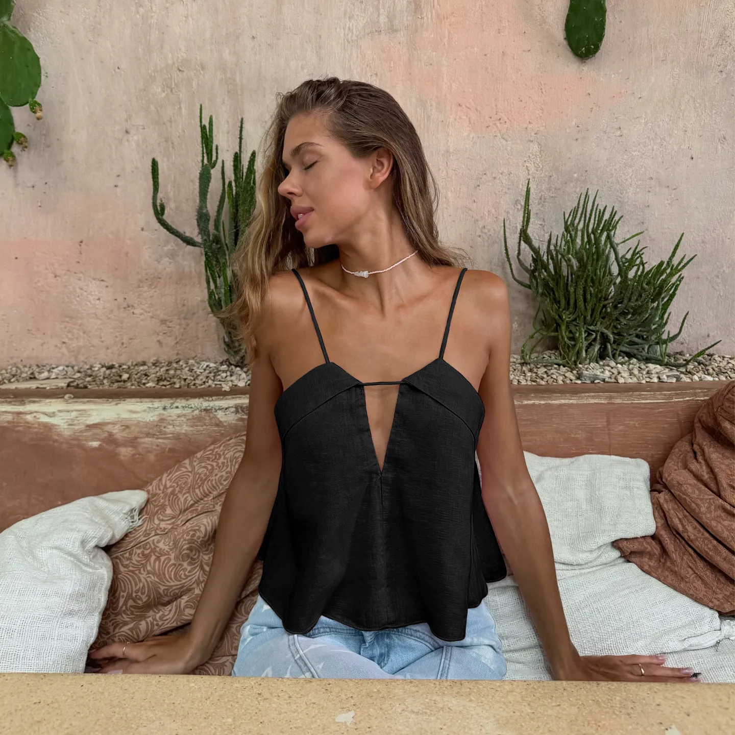
Soft Autumn is a warm, muted season in the 12-season colour analysis system. A soft autumn color palette focuses on low-saturation, medium-value colours such as muted olive, warm taupe, dusty rose, soft teal, camel, and gentle brown. The overall effect should feel warm, blended, natural, and never excessively bright or high-contrast.
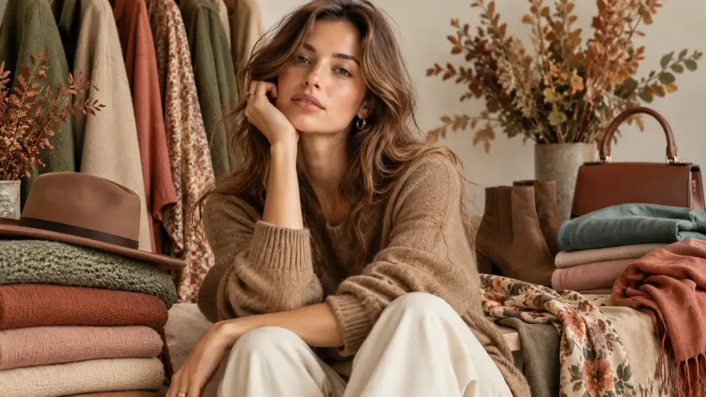
I am Lancy Chia from Truekung, a clothing factory in China with 20 years of export experience and more than 200 workers. From my factory side, colour is not only a styling question. It affects fabric sourcing, dyeing, lab dips, trims, prints, sample approval, MOQ, and bulk consistency.
When buyers develop soft autumn clothes, I usually ask them to define the actual colour standard instead of sending only names such as “sage,” “camel,” or “dusty pink.” One supplier’s sage can be another supplier’s olive. Below, I will explain how Soft Autumn works and how brands can translate this colour direction into practical clothing development.
What Defines the Soft Autumn Color Palette?
Soft Autumn can be confusing because it sits between warmer Autumn colours and the softer influence associated with Summer. If the colours become too saturated, the collection starts looking like a stronger Autumn palette. If they become too cool, the result moves closer to Soft Summer.
The main characteristics of Soft Autumn are muted colour, gentle warmth, and low-to-medium contrast. The palette generally stays around medium depth rather than relying heavily on very pale or very dark shades. For clothing development, think dusty, softened, earthy colours instead of clean, sharp, highly saturated ones.
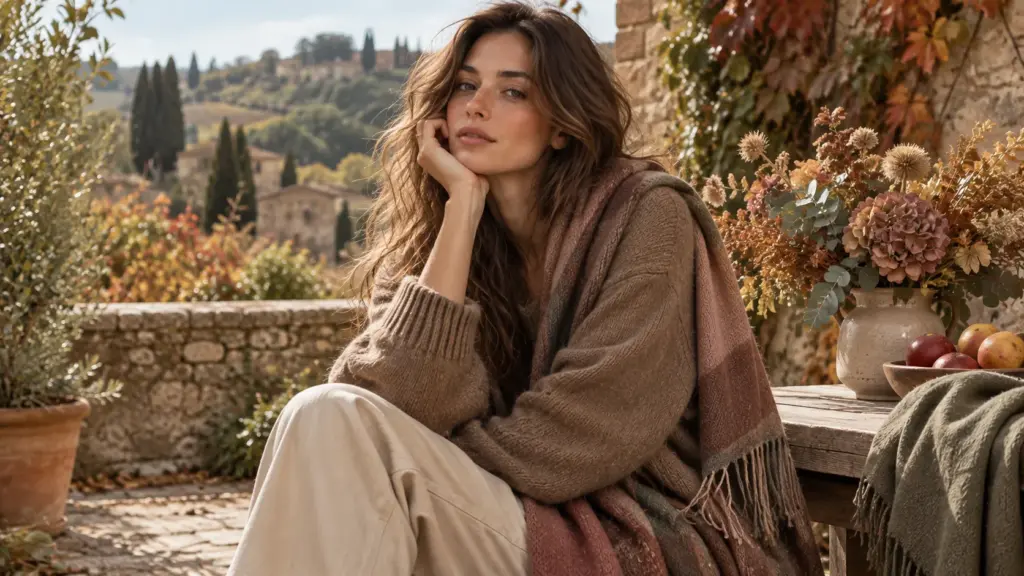
How Soft Autumn Colours Actually Work
The first point I look at is saturation. A typical soft autumn colour palette does not depend on vivid colours. Olive green, muted teal, dusty terracotta, warm rose, mushroom, camel, soft chocolate, and subdued mustard can all fit this direction when their saturation and undertone are controlled.
Warmth is also important, but “warm” does not mean every colour should look orange or golden. Soft Autumn is generally gentler than a strong True Autumn direction.
Value is the third factor. Most soft autumn colors work comfortably around the middle range. You can still use lighter and darker colours, but extreme white-to-black contrast usually works against the softness of the palette.
For apparel development, these three factors need to work together. A green can have a warm undertone but still look wrong if it is extremely bright. A brown can look earthy but become too dark for the intended palette.
In my factory experience, buyers get better results when they provide Pantone references, approved fabric swatches, or physical colour standards. Descriptive colour names are useful for communication, but they are not precise enough for bulk colour approval.
Why Colour Names Create Production Problems
One common mistake is treating online soft autumn color swatches as exact production standards.
Screens are not reliable enough for final colour approval. Phone brightness, monitor calibration, photography, fabric texture, and lighting can all change the appearance of the same colour. Fabric composition also matters. The same target shade can appear different on cotton jersey, polyester satin, denim, fleece, or a textured woven fabric.
Dit lijkt misschien onbeduidend, maar het kan de levering beïnvloeden.
For example, imagine a brand wants a muted olive sweatshirt and sends only a screenshot. The fabric supplier interprets the colour as a medium olive. The buyer later expects something more greyed and less yellow. A new lab dip may then be required.
The problem becomes more expensive when labels, rib, drawcords, embroidery, or zippers have already been ordered to coordinate with the first interpretation.
I usually ask buyers to check the main fabric colour first and then confirm matching trims. For critical colours, approving physical lab dips before bulk dyeing is much safer than relying only on a digital reference.
What to Check Before Approving Colours
| Wat te controleren | Waarom het belangrijk is | Wat ik voorstel |
|---|---|---|
| Colour reference | Names such as olive vary widely | Provide Pantone or an approved swatch |
| Samenstelling van de stof | Fibres absorb or display colour differently | Confirm colour on the actual fabric |
| Saturation | Bright shades can leave the Soft Autumn direction | Compare with approved muted references |
| Ondertoon | A colour may become too cool or too orange | Review samples under consistent lighting |
| Main fabric and trims | Different materials may not match perfectly | Approve them together when possible |
| Lab dip | Bulk dyeing is difficult to correct later | Approve before bulk production |
| Print colours | Several colours increase matching complexity | Set standards for important print colours |
| Volumetolerantie | Perfect visual identity is not always realistic | Agree on an acceptable standard before production |
When Better Colour Control Costs More
A large soft autumn color palette clothing collection can create a trade-off between colour variety and production efficiency. Suppose a buyer develops six sweatshirt styles with eight Soft Autumn colours. On paper, the range looks coordinated. From the factory side, however, eight custom colours can mean separate fabric dyeing requirements, lab dips, approvals, matching rib, thread, labels, and sometimes different material minimums. If the order quantity is small, spreading the total order across too many colours can increase cost or create MOQ problems. One practical approach is to build the range around three or four core colours, such as warm taupe, muted olive, dusty rose, and soft brown, and then add smaller accent colours where the fabric supplier can support them. This keeps the visual identity while simplifying sourcing. I have seen buyers lose time because they confirmed the garment quantity before checking the MOQ for each custom fabric colour. The decision rule I suggest is simple: before finalizing the number of colours, divide your total order into quantity per fabric, per colour, and per style, then ask whether those quantities meet the supplier’s actual material MOQ. A beautiful palette still has to work commercially.
Which Soft Autumn Colors Work Best for Clothing?
A colour can look attractive on a mood board but perform very differently when it covers an entire coat, dress, sweatshirt, or pair of trousers. Brands therefore need to think about both seasonal colour theory and the physical scale of the garment.
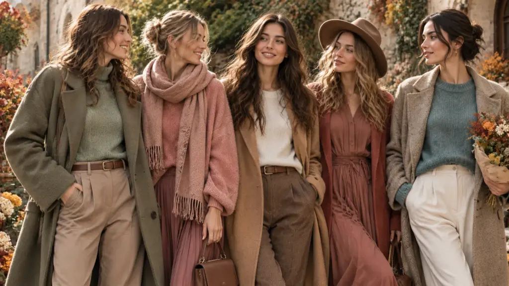
Useful colors for Soft Autumn clothing include muted olive and sage, camel, warm beige, mushroom, taupe, dusty coral, muted rose, terracotta, softened teal, warm navy alternatives, and gentle browns. The best colors for Soft Autumn are generally warm-neutral, desaturated, and easy to combine without creating sharp contrast.
Building Neutrals Before Accent Colours
For a commercial soft autumn wardrobe, I would normally start with neutrals.
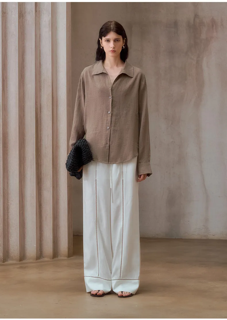
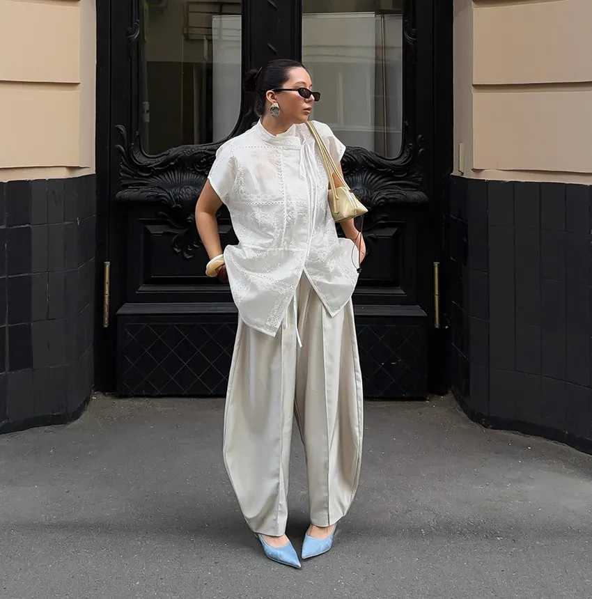
Useful directions include cream, oatmeal, warm beige, mushroom, taupe, camel, soft khaki, warm grey-brown, cocoa, and muted dark brown. These shades can form the foundation of trousers, jackets, coats, knitwear, skirts, and basic tops.
Then you can introduce soft autumn greens such as sage and olive, softened blues or teal tones, dusty reds, muted peach, warm rose, and subdued purple directions.
The important word is “softened.”
A clear emerald green is different from a greyed olive. A bright tomato red is different from muted brick or dusty terracotta. Pure cobalt is very different from a softened blue-green.
The fabric surface also changes the result. Brushed fabrics, washed cotton, garment-dyed materials, melange yarns, suede-like textures, and matte woven fabrics can naturally support a muted appearance. Smooth, highly lustrous materials may make the same nominal colour appear stronger.
Voor een soft autumn capsule wardrobe, I suggest using a limited group of repeatable neutrals and adding controlled accent colours. This also makes it easier for customers to combine garments after purchase.
Soft Autumn Colors to Avoid in a Collection
The most obvious soft autumn colors to avoid are usually very bright, icy, or sharply contrasting colours when the goal is a consistent Soft Autumn story.
Pure optical white and strong black can create much harder contrast than cream and dark warm brown. Electric blue, vivid fuchsia, neon green, and highly saturated purple may dominate a muted collection.
However, brands should not treat seasonal colour analysis as an absolute manufacturing rule.
Your target customer and brand identity still matter. A black trouser can be commercially important even if it is not a classic Soft Autumn wardrobe colour. Similarly, white may be necessary for basics.
A serious clothing supplier should explain the difference between a design concept and a production requirement. If you want a strict muted autumn color palette, tell the supplier which colours must follow that direction. If black and white are commercial basics outside the seasonal palette, identify them separately.
Another issue is print design. A floral print may contain mostly Soft Autumn colours but include one extremely bright accent. Depending on the area and placement, that accent can change the overall appearance.
For private-label development, I recommend approving the complete print strike-off rather than judging individual colour chips alone.
How to Build a Wearable Palette
| Wat te controleren | Waarom het belangrijk is | Wat ik voorstel |
|---|---|---|
| Kernneutralen | They connect the whole collection | Start with 2–4 repeatable neutrals |
| Olive and sage | Important Soft Autumn directions | Keep saturation controlled |
| Browns | They can replace harsh black | Test camel, cocoa, taupe, and chocolate |
| Reds and pinks | Bright versions can dominate | Use dusty, brick, coral, or muted rose directions |
| Blues | Very cool blues may feel disconnected | Consider softened teal and muted blue |
| Wit | Optical white can appear harsh | Test cream, ivory, or warm off-white |
| Zwart | Creates strong contrast | Consider warm charcoal or dark brown |
| Afdrukken | One bright shade can change the effect | Approve the full printed fabric |
Balancing Seasonal Colour and Commercial Demand
A strict soft autumn palette and a commercially successful colour assortment are not always exactly the same thing. Imagine a buyer ordering 3,000 pieces across a jacket, skirt, dress, and T-shirt range. The design team wants ten seasonal colours, while the sales team knows that neutral beige, brown, and olive are likely to be easier to combine across the range. Producing all ten custom colours may divide the order into small fabric lots. This can create higher material costs, additional lab-dip rounds, and more complicated production planning. A practical alternative is to identify “core,” “seasonal,” and “accent” colours. Core colours can repeat across several styles. Seasonal colours can appear in selected garments, while accent colours can be used in prints, embroidery, piping, or smaller product groups. For example, camel and mushroom might run across four styles, while dusty coral appears only in dresses and tops. My suggestion is to use this decision rule: a colour should earn its place in the collection through either meaningful sales potential or meaningful design value. If it does neither, removing it may improve both the range and the production plan.
How Can Brands Develop Soft Autumn Outfits for Bulk Production?
Creating attractive soft autumn outfits is one task. Reproducing the same colour story across hundreds or thousands of garments is another. Fabric lots, washing, trims, printing, and dyeing can introduce differences that are difficult to see on a digital mood board.
For bulk Soft Autumn clothing, establish the palette first, then confirm fabric, colour references, lab dips, trims, prints, samples, and bulk tolerances. Keep important colours consistent across related garments. The softer and more closely coordinated your palette is, the more noticeable unwanted colour differences may become.
Turning a Palette Into Real Garments
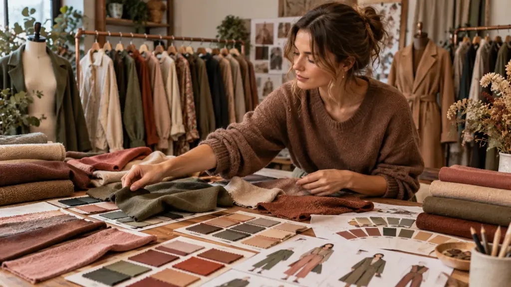
Once the color palette for Soft Autumn is approved, the next step is connecting each colour with an actual garment and fabric.
A dusty rose can work differently in a cotton T-shirt, satin dress, wool-blend coat, or washed denim skirt. Fabric texture changes how light reflects, so the visual colour can shift even when the target is similar.
For OEM/ODM development, I prefer buyers to organize colours by material group. If three garments use exactly the same cotton jersey, using the same fabric source and dye lot where practical can improve consistency. If the garments use different fabrics, an exact visual match may be more difficult.
The same issue applies to trims. A polyester zipper tape, cotton drawcord, embroidery thread, plastic button, and main fabric do not necessarily take or reflect colour in the same way.
This is why “all trims must match the fabric” needs a realistic approval standard.
You should also consider wash processes. Denim washing, garment washing, enzyme washing, pigment effects, and other finishing processes can change colour appearance.
Voor soft autumn clothing colors, where small differences between muted shades can matter visually, the approved sample should clearly show what the buyer expects before bulk production starts.
Why Bulk Colours Can Differ From Samples
Buyers sometimes assume an approved sample guarantees mathematically identical colour in every future production run. Textile production is more complicated.
Different dye lots can create variation. Fibre composition, fabric construction, finishing, washing, temperature, chemicals, and even the visual conditions used for inspection can affect colour assessment.
This does not mean variation should simply be accepted without control. It means the buyer and supplier need a clear standard.
For important custom colours, ask how the supplier controls lab dips and bulk fabric approval. Confirm whether your colour standard is a Pantone reference, an approved lab dip, an approved fabric cutting, or another agreed reference.
I usually ask buyers to check the colour under suitable and consistent lighting rather than approving it from a phone photo.
Packaging deserves attention too. If a collection includes multiple similar browns or greens, carton marks, SKU labels, barcodes, polybag stickers, and packing lists need to identify them correctly. Similar colour names can create packing mistakes if the SKU system is unclear.
For export orders, colour control is therefore connected to QC and logistics, not only design. The clearer the colour code and approval record, the easier it is to trace problems.
What to Confirm Before Bulk Production
| Wat te controleren | Waarom het belangrijk is | Wat ik voorstel |
|---|---|---|
| Goedgekeurd voorbeeld | Establishes the garment reference | Keep a signed or confirmed standard |
| Lab dip | Controls custom fabric colour | Approve before bulk dyeing |
| Verfpartij | Different lots may show variation | Plan related styles carefully |
| Sierlijsten | Different materials display colour differently | Approve visible trims with fabric |
| Wassen | Finishing can change colour | Test on the intended garment |
| Afdrukproef | Printed colours may shift on fabric | Approve before bulk printing |
| Colour code | Similar shades can be mixed during packing | Use clear SKU and colour names |
| QC lighting | Lighting changes colour perception | Use consistent inspection conditions |
Matching Colour Accuracy With MOQ and Lead Time
Colour accuracy, low MOQ, low price, and fast delivery can pull production in different directions. Consider a small brand developing soft autumn palette clothes in five custom shades, with 100 pieces per colour. If the chosen fabric supplier requires a higher dyeing quantity for each custom colour, the clothing factory cannot solve the issue simply by cutting fewer garments. The fabric MOQ still exists upstream. The buyer may need to accept a material surcharge, increase the quantity, select available stock colours, reduce the number of colours, or change the fabric. A similar issue occurs when a buyer requests an urgent delivery but still needs several rounds of custom lab dips. Colour development needs approval time before bulk material can proceed. In my factory experience, the most efficient projects establish priorities early. For example, if exact muted olive is essential to the brand, allow time and quantity for custom development. If the launch date is more important, an acceptable stock olive may be the better commercial choice. My decision rule is: rank colour accuracy, MOQ, target price, and delivery date before sampling starts. When these requirements conflict, the factory then knows which factor it is allowed to adjust instead of guessing.
Wat moet je voorbereiden voordat je contact opneemt met een Chinese kledingfabriek?
Before requesting prices for soft autumn clothes, prepare enough information for the factory to understand both the garment and the commercial requirements.
| Informatie | Voorbeeld | Waarom het nodig is |
|---|---|---|
| Product | Jurk, jasje of sportkleding | Bevestigt geschiktheid voor de fabriek |
| Foto's/technisch pakket | Afbeeldingen, afmetingen, constructie | Ondersteunt prijsbepaling en ontwikkeling |
| Stof | Katoen, denim, polyester of een onbekende stof. | Heeft invloed op de kosten, de minimale bestelhoeveelheid (MOQ) en de levertijd. |
| Maten | XS–XL of een aangepaste maattabel | Beïnvloedt eetpatronen en consumptiegedrag. |
| Hoeveelheid | Per stijl en kleur | Heeft invloed op de minimale bestelhoeveelheid (MOQ) en de eenheidsprijs. |
| Markt | EU, VK, VS of Australië | Heeft invloed op de maatvoering en de naleving van de voorschriften. |
| Kwaliteitsniveau | Groothandel of premium | Richtlijnen voor materialen en vakmanschap |
| Verpakking | Plastic zak, doos of barcode | Heeft invloed op de kosten en de timing. |
| Labels | Hals, onderhoud, maat en hanglabel | Heeft invloed op het artwork, de minimale bestelhoeveelheid (MOQ) en de kosten. |
| Termijn | Aankomstdatum in het magazijn | Ondersteunt de productieplanning. |
| Certificaten | Vereiste certificaten | Bevestigt naleving |
| Richtprijs | FOB- of leveringsprijs | Helpt bij het aandragen van realistische opties. |
Clear information helps us provide a more accurate price, timeline, material suggestion, and production plan.
For a Soft Autumn collection, I would also add your colour references. If you already have Pantone numbers, fabric swatches, or an approved soft autumn color palette, send them with the inquiry.
Separate essential requirements from optional preferences. For example, “this exact dusty olive is essential” is different from “any muted green is acceptable.” The second gives the factory more flexibility to find suitable stock fabrics, reduce MOQ pressure, or shorten development time.
Wanneer moet je Truekung om een offerte vragen?
Truekung may suit buyers who need OEM/ODM clothing production, private-label development, sample support, bulk production, QC, and stable export communication.
You do not need to have every technical detail ready before contacting us. If you have product images or a tech pack, send them together with the expected quantity, sales market, quality requirements, colour direction, and delivery expectations.
Voor een soft autumn wardrobe or seasonal collection, it is especially useful to tell us whether you need custom fabric colours or whether suitable stock colours are acceptable. We can then discuss the practical impact on sampling, MOQ, cost, and production timing.
You can contact me at [email protected] of bezoek https://truekung.com.
Conclusie
A successful soft autumn color palette should be muted, gently warm, and commercially practical. For clothing production, do not stop at attractive colour swatches. Confirm fabric, colour standards, MOQ, trims, samples, QC, and bulk tolerances before production begins.
Weergaven: 0