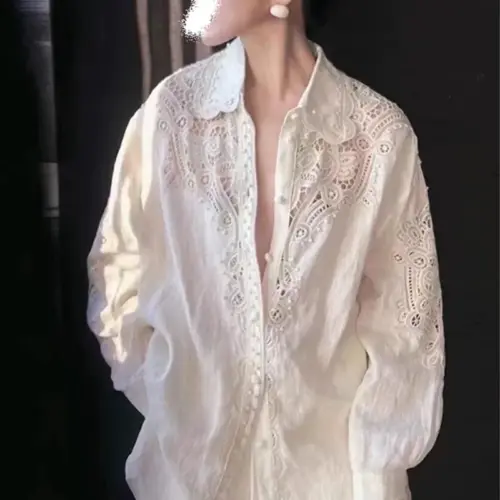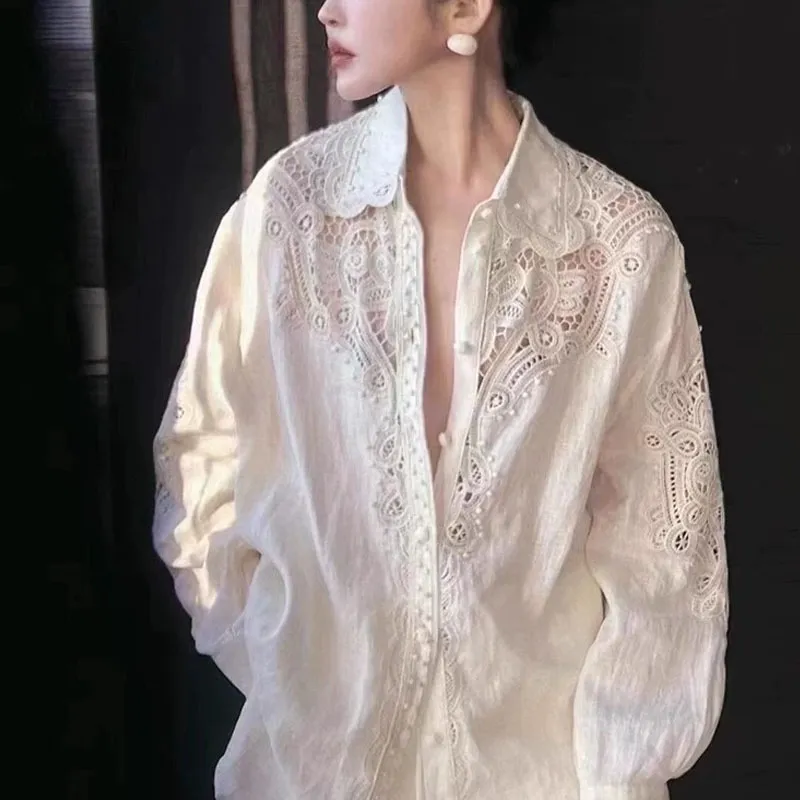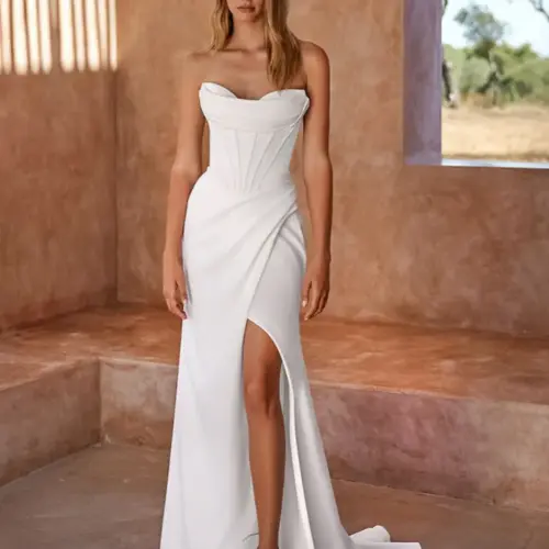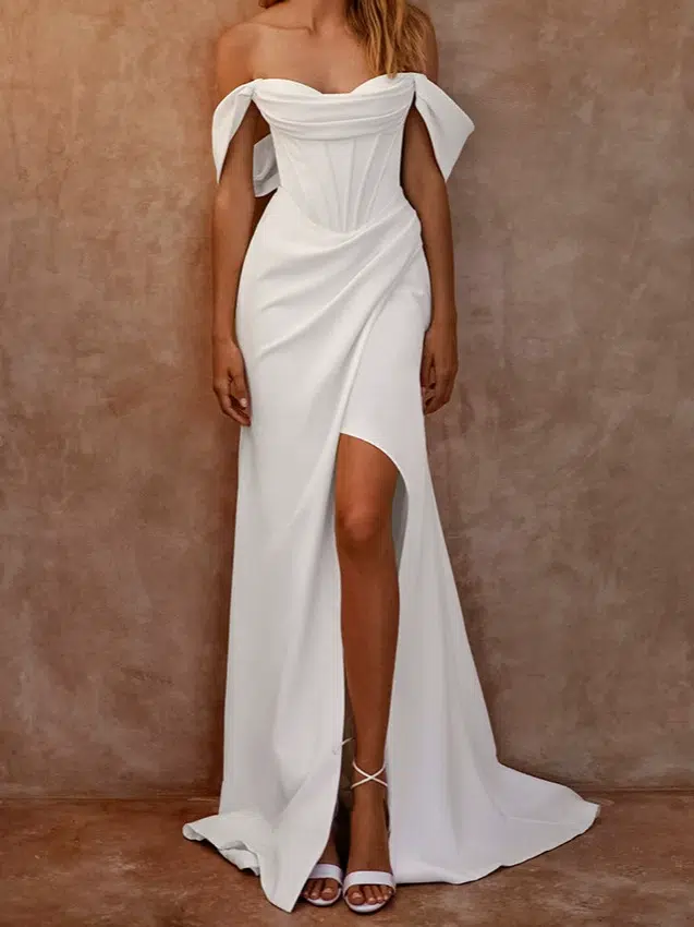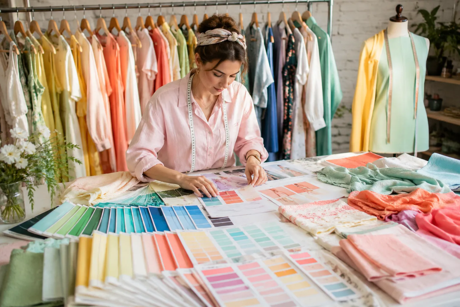

Frühlingsfarben wirken frisch, warm und lebendig, doch die Farbauswahl für Kleidung ist nicht so einfach wie die Wahl einiger weniger leuchtender Töne. Selbst eine schöne Farbe kann in der Massenproduktion an Wirkung verlieren, da Stoff, Färbung, Verzierungen und Lichtverhältnisse die Wahrnehmung durch die Käufer beeinflussen.
Frühlingsfarben umfassen üblicherweise warme, klare und frische Töne wie Koralle, Pfirsich, warmes Gelb, Aquamarin, Mint, Türkis, frisches Grün und warme Neutraltöne. In der saisonalen Farbanalyse wird die Frühlingspalette üblicherweise in hellere, wärmere und leuchtendere Nuancen unterteilt. Für Bekleidungseinkäufer ist es wichtig, diese Farbideen in reproduzierbare Stofffarben umzusetzen.
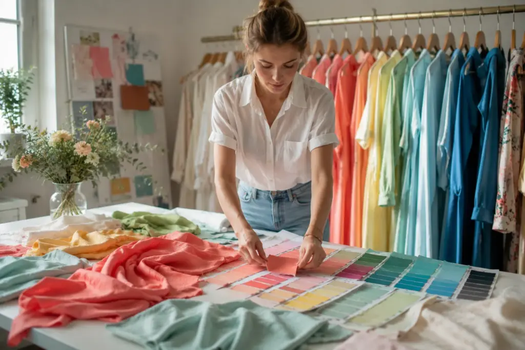
Ich bin Lancy Chia von Truekung. Wir sind eine Bekleidungsfabrik in China mit 20 Jahren Exporterfahrung und über 200 Mitarbeitern. Meine Erfahrung zeigt, dass Farbgespräche deutlich praxisorientierter werden, sobald ein Käufer von der ersten Inspiration zur Mustererstellung und schließlich zur Serienproduktion übergeht. Die Farben auf dem Bildschirm, Stoffmuster, Farbmuster im Labor, Musterkleidungsstück und fertige Serienkleidung können leicht voneinander abweichen.
Dieser Leitfaden erklärt Frühlingsfarben aus der Perspektive der Modebeschaffung. Ich gehe auf die wichtigsten Frühlingsfarben ein, erkläre, wie Stoffe die Farbe verändern und worauf Einkäufer achten sollten, bevor sie Kleidungsstücke in Frühlingsfarben für die Produktion freigeben.
Welche Frühlingsfarben sind in der Mode angesagt?
Der Frühling klingt einfach: frisches Gelb, Grün, Rosa, Blau und Orange. Das Problem ist, dass “Frühlingsfarbe” keine technische Produktionsvorgabe ist. Wenn ein Käufer nur eine Farbbezeichnung angibt, kann der Lieferant den Farbton unterschiedlich interpretieren.
Frühlingsfarben sind im Allgemeinen frisch, lebendig, warm und relativ klar – typische Farben der Frühlingszeit. Gängige Beispiele sind Pfirsich, Koralle, Buttergelb, Mint, frisches Grün, Aquamarin, Türkis, warmes Rosa und helle, warme Neutraltöne. Die genaue Frühlingsfarbpalette hängt vom jeweiligen Modekonzept, der Zielgruppe, dem Stoff und dem aktuellen Farbtrend der Saison ab.
Wie Frühlingsfarben in der Kleidung wirken
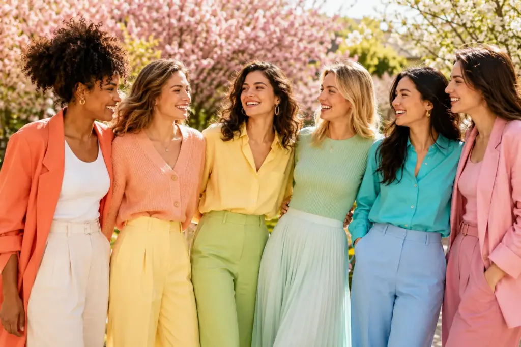
Wenn mich Einkäufer fragen: “Was sind Frühlingsfarben?”, möchte ich zunächst wissen, was sie unter Frühling verstehen. Sie meinen vielleicht saisonale Modefarben, ein Farbanalysesystem für den Frühling oder einfach Farben für eine Frühlingskollektion. Das sind verwandte, aber nicht identische Konzepte.
Bei kommerziellen Kollektionen weichen die Frühlingsfarben oft von den schweren Schwarz-, Dunkelbraun-, Burgunder- und tiefen Marineblautönen ab, die man üblicherweise mit kälteren Jahreszeiten verbindet. Käufer greifen stattdessen eher zu helleren Neutraltönen, frischen Grüntönen, Gelbtönen, Koralle, Rosa, Türkis oder Hellblau. Die richtige Farbauswahl hängt jedoch vom jeweiligen Produkt ab.
Ein helles Gelb wirkt auf einem leichten Kleid ganz anders als auf einer Daunenjacke. Mintgrün sieht auf Sportbekleidung frisch aus, kann aber auf strukturiertem Stoff matt wirken. Auch Koralle kann nach dem Färben auf einem Bildschirm ganz anders aussehen.
Ich bitte Einkäufer üblicherweise, die Farbe zusammen mit dem tatsächlichen Material zu prüfen. Die gesamte Frühjahrspalette sollte nicht allein anhand eines digitalen Moodboards freigegeben werden. Sobald die Kollektion in die Entwicklungsphase geht, sollte für jeden wichtigen Farbton eine klare physische oder standardisierte Farbreferenz vorliegen, an der sich der Lieferant orientieren kann.
Warum Farbbezeichnungen Produktionsprobleme verursachen
“Mint”, “Pfirsich”, “Frühlingsgrün” und “Koralle” klingen im Gespräch zwar präzise, können aber viele verschiedene Grüntöne bezeichnen. Zwei Personen können zwei deutlich unterschiedliche Grüntöne sehen und trotzdem beide als Mint bezeichnen.
Dies wird besonders problematisch, wenn mehrere Materialien in einem Kleidungsstück verarbeitet werden. Stellen Sie sich ein frühlingsgrünes Sweatshirt vor, das aus einem Strickstoff besteht, mit Rippstrick, Stickgarn, Reißverschlussband und einem aufgedruckten Logo. Selbst wenn alle Lieferanten die Anweisung “Frühlingsgrün” erhalten, stimmen die fertigen Komponenten möglicherweise nicht überein.
Die Materialzusammensetzung ist ein weiterer Faktor. Baumwolle, Polyester, Nylon, Denim und Mischgewebe werden nicht mit exakt denselben Färbeverfahren behandelt. Auch Oberflächenstruktur und Veredelung beeinflussen das visuelle Ergebnis. Eine gebürstete Oberfläche kann einen Farbton weicher wirken lassen. Eine glänzende, synthetische Oberfläche kann dieselbe Farbe leuchtender erscheinen lassen.
Ich habe schon erlebt, dass Käufer Zeit verloren haben, weil die Farbvorgaben zwar klar waren, aber in den Produktionsunterlagen nicht eindeutig definiert wurden. Ein seriöser Bekleidungslieferant sollte erläutern, wie sich das gewählte Material auf die Farbentwicklung auswirkt. Vor der Serienproduktion sollten Käufer außerdem wissen, welcher Farbstandard für die Freigabe verwendet wird und wie die Farbabstimmung kontrolliert wird.
Was vor der Farbfreigabe zu klären ist
| Warum es wichtig ist | Warum es wichtig ist | Meine Empfehlung |
|---|---|---|
| Farbreferenz | Bezeichnungen wie Minze oder Koralle sind subjektiv. | Bitte geben Sie ein physisches Farbmuster oder eine anerkannte Farbreferenz an. |
| Stoffzusammensetzung | Unterschiedliche Fasern geben Farben unterschiedlich wieder. | Bitte prüfen Sie den Stoff vor der endgültigen Farbfreigabe. |
| Stoffoberfläche | Textur und Glanz verändern das visuelle Erscheinungsbild | Prüfen Sie den Farbton auf dem tatsächlichen oder einem ähnlich aussehenden Stoff. |
| Labortauchgang oder Abstrich | Es zeigt, wie die gewünschte Farbe auf dem Material umgesetzt wird. | Gegebenenfalls vor dem Färben der großen Mengen genehmigen. |
| Zierleisten | Rippstrick, Nähte, Reißverschlüsse und Etiketten können Farbunterschiede aufweisen. | Geben Sie an, ob die Zierleisten farblich übereinstimmen oder einen Kontrast bilden müssen. |
| Beleuchtung | Farben können unter unterschiedlichem Licht unterschiedlich erscheinen. | Verwenden Sie eine vereinbarte Betrachtungsmethode |
| Massentoleranz | Die Produktion kann nicht allein anhand eines Bildschirmbildes beurteilt werden. | Vor Produktionsbeginn den Genehmigungsstandard festlegen. |
Wenn mehr Farben die Sammelkosten erhöhen
Eine große Auswahl an Frühlingsfarben wirkt auf einem Farbboard zwar ansprechend, doch jede zusätzliche Farbe kann die Beschaffung und Produktion komplexer gestalten. Angenommen, ein Käufer wünscht sich ein T-Shirt-Modell in acht leuchtenden Frühlingsfarben, bestellt aber nur eine geringe Gesamtmenge. Die Bestellung mag in der Summe groß erscheinen, während die Menge jeder einzelnen Farbe für ein effizientes Färben des Stoffes noch zu gering ist. Der Stofflieferant kann für jede Sonderfarbe eine Mindestbestellmenge festlegen, und Etiketten, Druck, Rippbündchen oder andere passende Komponenten können zusätzliche Mindestmengen bedingen.
Der Käufer hat dann mehrere Möglichkeiten. Er kann die Menge pro Farbe erhöhen, die Anzahl der Farben reduzieren, verfügbare Stofffarben auswählen oder gegebenenfalls zusätzliche Entwicklungs- oder Materialkosten akzeptieren. Die optimale Lösung hängt vom Stoff und der Bestellung ab.
Mein Vorschlag ist, die Mindestbestellmenge (MOQ) wie folgt zu berechnen: Stil, Stoff, Farbe und Anpassungsanforderungen, nicht nur die Gesamtbestellmenge spielt eine Rolle. Beispielsweise kann die Herstellung von 1.000 Stück in zehn Farben schwieriger sein als die von 1.000 Stück in drei Farben.
Meine Entscheidungsregel für Einkäufer ist einfach: Ist die Farbvielfalt wichtiger als die exakte Individualisierung, sollten Sie zunächst die verfügbaren Materialfarben prüfen. Ist hingegen eine exakte, markenspezifische Frühlingsfarbpalette unerlässlich, klären Sie vor der endgültigen Festlegung der Kollektion die Mindestbestellmenge für Sonderfarben und die Entwicklungsanforderungen.
Worin unterscheiden sich helle, warme und leuchtende Frühlingsfarbpaletten?
Ein Käufer kann sich für “Frühlingsfarben” entscheiden und trotzdem eine Kollektion erhalten, die keine klare visuelle Richtung aufweist. Helle, warme und leuchtende Farbtöne erzeugen unterschiedliche Eindrücke; ihre planlose Kombination kann daher zu einem inkonsistenten Erscheinungsbild führen.
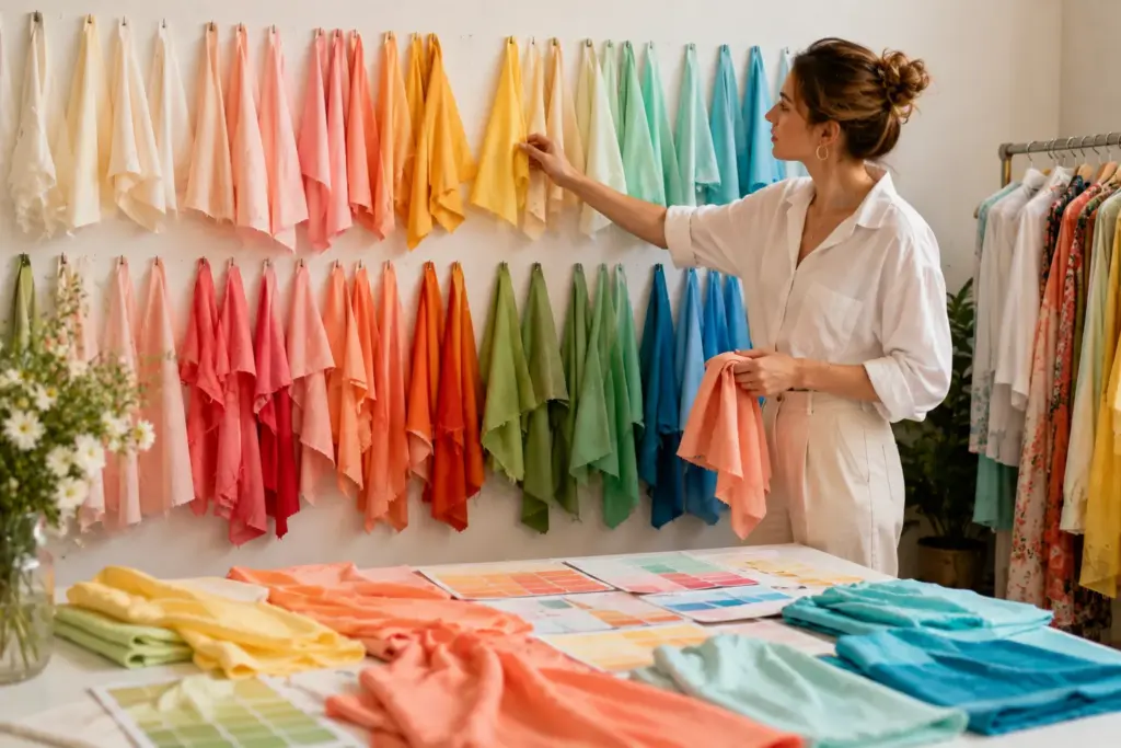
Eine helle Frühlingsfarbpalette betont helle, frische Farbtöne. Eine warme Frühlingspalette tendiert zu sonnigem Gelb, Pfirsich, Koralle und warmem Grün. Eine leuchtende Frühlingsfarbpalette verwendet klarere und kräftigere Farben. Diese Kategorien können als Orientierung für Modedesign dienen, doch benötigen Fabriken weiterhin spezifische Farbvorgaben für die Produktion.
Die richtige Frühlingsfarbenrichtung wählen
A helle Frühlingsfarbpalette Dazu gehören zarte Pfirsichtöne, helles Türkis, warmes Elfenbein, blasses Gelb, frisches Hellgrün und andere klare, aber hellere Nuancen. Diese Farben eignen sich je nach Design und Zielgruppe für Kleider, Blusen, T-Shirts, Kinderbekleidung und leichte Saisonartikel.
A warme Frühlingsfarbpalette Der Trend geht hin zu wärmeren Farbtönen. Denken Sie an warmes Gelb, Aprikose, Pfirsich, Koralle, orangefarbene Rottöne und gelbbasierte Grüntöne. Käufer, die eine wirklich warme Frühlingsfarbpalette suchen, können diese Farbtöne auch beim Zusammenstellen aufeinander abgestimmter Kollektionen verwenden.
A leuchtende Frühlingsfarbpalette Sie verleihen der Kollektion mehr visuelle Energie. Klares Türkis, leuchtendes Korallenrot, frisches Grün, strahlendes, warmes Rosa und kräftiges Gelb sorgen für eine auffälligere Kollektion. Diese Farben eignen sich für Sportbekleidung, Freizeitkleidung, Statement-Pieces und Kollektionen, bei denen die Wirkung im Regal entscheidend ist.
Online stößt man mitunter auch auf Begriffe wie „sanfte Frühlingsfarbpalette“, „kühle Frühlingsfarbpalette“, „tiefe Frühlingsfarbpalette“ oder „frühe Frühlingsfarbpalette“. Die Terminologie wird in der Mode- und persönlichen Farbberatung jedoch nicht immer einheitlich verwendet.
Bei der Herstellung ist mir das Etikett weniger wichtig als der tatsächliche Farbton. Geben Sie der Fabrik eine genehmigte Referenz, anstatt sie selbst entscheiden zu lassen, wie “echter Frühling” auszusehen hat.
Warum helle und helle Farbtöne unterschiedliche Aufmerksamkeit erfordern
Helle Frühlingsfarben wirken zwar schlicht, doch gerade blasse Töne können Details des Stoffes und der Verarbeitung deutlicher hervortreten lassen. Transparenz des Stoffes, Verunreinigungen, Flecken, ungleichmäßige Färbung oder Unterschiede zwischen Obermaterial und Futter können bei hellen Kleidungsstücken stärker sichtbar werden.
Leuchtende Frühlingsfarben bringen andere Herausforderungen mit sich. Ein kräftiger Farbton kann das Zusammenpassen der einzelnen Komponenten erschweren, da selbst geringfügige Unterschiede zwischen Hauptstoff und Besatz deutlich sichtbar sein können. Werden für das Kleidungsstück verschiedene Faserzusammensetzungen kombiniert, erfordert das Erzielen eines einheitlichen Farbtons bei allen Komponenten besondere Aufmerksamkeit.
Bedruckte Stoffe stellen ein weiteres Problem dar. Ein Käufer könnte beispielsweise eine Frühlingsfarbpalette digital freigeben und erwarten, dass der bedruckte Stoff dieselbe Farbintensität aufweist. Das tatsächliche Ergebnis hängt jedoch vom Basismaterial, dem Druckverfahren, der Grafik und der Veredelung ab. Bei bedruckten Produkten kann daher ein Andruck oder ein geeignetes Druckmuster vor der Serienproduktion wichtig sein.
Das mag unbedeutend erscheinen, kann aber Auswirkungen auf die Lieferung haben. Wenn der Käufer erst beim finalen Muster einen Farbton beanstandet, der bereits während der Materialentwicklung hätte bestätigt werden müssen, muss die Fabrik möglicherweise eine weitere Stoff- oder Druckentwicklungsrunde durchführen.
Die Farbfreigabe sollte als Teil des Produktionsplans betrachtet werden und nicht als Dekoration, die erst hinzugefügt wird, nachdem alles andere fertig ist.
Wie man Frühlingsfarben vergleicht
| Warum es wichtig ist | Warum es wichtig ist | Meine Empfehlung |
|---|---|---|
| Helle Frühlingsfarben | Blasse Farbtöne können Stoffprobleme sichtbar machen | Prüfen Sie Transparenz, Oberfläche und tatsächliches Gewebe. |
| Warme Farbtöne | Untertöne können das Erscheinungsbild der Kollektion verändern | Vergleichen Sie physische Stoffmuster miteinander. |
| Leuchtende Frühlingsfarben | Kleine Unterschiede in der Übereinstimmung können offensichtlich sein | Prüfen Sie die Verzierungen neben dem Hauptstoff. |
| Weiß oder elfenbein | Unterschiedliche Weißtöne können sich beißen. | Definieren Sie den exakten Farbton für jede Komponente. |
| Gedruckte Farben | Die Ergebnisse auf Siebdruck und Stoff können unterschiedlich sein. | Genehmigen Sie eine Löschung, wenn erforderlich |
| Farbkombinationen | Einzelne Farben mögen harmonieren, aber zusammen wirken sie unharmonisch. | Sehen Sie sich die gesamte Farbpalette der Kollektion an. |
| Zielmarkt | Die kommerziellen Präferenzen variieren je nach Käufer und Region. | Wählen Sie die Farben basierend auf Ihrem Kunden und Ihrem Verkaufsplan aus. |
Exakte Farbe oder schnellere Lieferung?
Exakte Individualisierung und schnelle Lieferung können sich gegenseitig ausschließen. Individuelle Frühlingsfarben erfordern unter Umständen die Materialbeschaffung, Farbentwicklung, Freigabe, Färbung, gegebenenfalls Tests und anschließend die Konfektionierung. Eine verfügbare Stofffarbe kann einige dieser Schritte überflüssig machen, auch wenn sie möglicherweise nicht exakt der ursprünglichen Frühlingsfarbpalette des Designers entspricht.
Stellen Sie sich beispielsweise einen Einkäufer vor, der eine leichte Frühlingskleiderkollektion mit einem festen Veröffentlichungstermin entwickelt. Der gewünschte Pfirsichton erfordert eine Sonderfärbung des Stoffes, ein ähnlicher Pfirsichton ist jedoch bereits von einem geeigneten Materiallieferanten erhältlich. Wenn der exakte Farbton zentral für die Markenkampagne ist, kann es sinnvoll sein, auf die Sonderanfertigung zu warten. Wenn es jedoch vorrangig darum geht, schnell eine Testbestellung auf den Markt zu bringen, ist der verfügbare Farbton möglicherweise die praktischere Wahl.
Der Preis ist nur ein Aspekt bei dieser Entscheidung. Käufer sollten auch die Mindestbestellmenge, die Genehmigungszeit, die Stoffverfügbarkeit, die Zuverlässigkeit bei Folgebestellungen und den Liefertermin im Lager berücksichtigen.
Meine Erfahrung in der Produktion zeigt, dass Einkäufer bessere Entscheidungen treffen, wenn sie uns mitteilen, welche Anforderungen unverhandelbar sind. Ist die exakte Farbe entscheidend? Ist der Liefertermin festgelegt? Ist der Zielpreis festgelegt? Ist die Menge begrenzt?
Meine Kaufentscheidungsregel lautet: Schützen Sie die Anforderung, die Ihren Vertriebsplan direkt beeinflusst, und gehen Sie bei den anderen Anforderungen kontrollierte Kompromisse ein. Verlangen Sie nicht nach einem exakten Sonderfarbton, einer sehr niedrigen Mindestbestellmenge, dem niedrigsten Preis und der kürzesten Lieferzeit, ohne vorher zu prüfen, ob diese Anforderungen realistisch miteinander vereinbar sind.
Wie können Käufer die Frühlingsfarben in der Massenproduktion kontrollieren?
Ein perfektes Muster garantiert nicht automatisch identische Serienkleidung. Materialchargen, Färbung, Verzierungen, Drucke und Produktionszeiten können Abweichungen verursachen. Ohne einen klaren Freigabeprozess kann eine Farbabweichung erst auftreten, nachdem bereits ein Großteil der Arbeit erledigt ist.
Um die Farbtreue bei der Serienproduktion im Frühjahr zu gewährleisten, sollten Stoff- und Farbstandards vor Produktionsbeginn festgelegt, relevante Farbentwicklungen freigegeben, die Farbabstimmung der Besätze definiert und Rohmaterialien sowie Kleidungsstücke anhand freigegebener Referenzen geprüft werden. Käufer sollten zudem ihre Farbanforderungen vor Produktionsbeginn mitteilen und die Farben nicht erst nach dem Versand beurteilen.
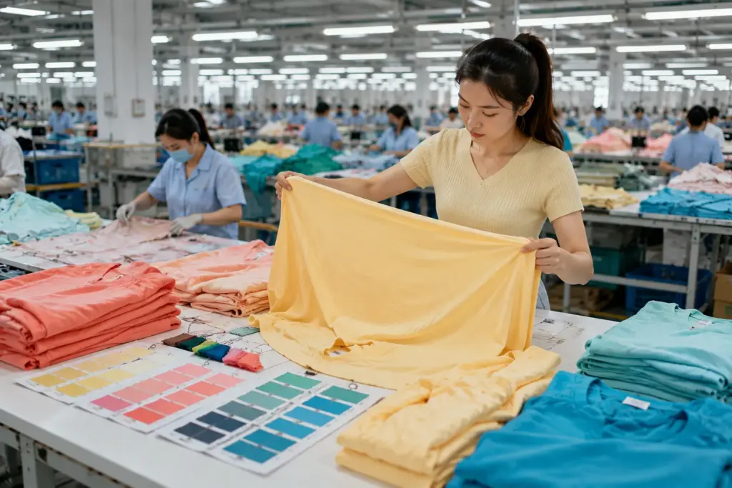
Von der Farbreferenz bis zum fertigen Kleidungsstück
Die Farbkontrolle sollte vor dem Zuschnitt und der Konfektionierung beginnen. Zunächst müssen Käufer und Lieferant Material, Zusammensetzung, Konstruktion, Oberflächenbehandlung und den gewünschten Farbton festlegen. Bei Sonderfärbungen muss die Farbentwicklung üblicherweise vor der Freigabe des Rohmaterials erfolgen.
Nachdem der Stoff bestätigt wurde, sollten die übrigen Komponenten den genehmigten Designvorgaben entsprechen. Dazu gehören Rippstrick, Futter, Reißverschlussband, Nähgarn, Gummibänder, Kordelzüge, Knöpfe, Stickereien, Drucke, Nackenetiketten und andere sichtbare Verzierungen.
Das QC-Team sollte Farben nicht aus dem Gedächtnis beurteilen. Es muss eine genehmigte Referenz vorliegen. Je nach Produkt und Prozess kann dies ein genehmigtes Farbmuster, ein Laborabzug, eine Probe, ein Muster oder ein anderer vereinbarter Standard sein.
Auch große Stoffmengen erfordern vor dem Zuschnitt besondere Aufmerksamkeit. Wird ein schwerwiegender Farbfehler erst nach dem Nähen aller Kleidungsstücke entdeckt, gestaltet sich die Korrektur deutlich schwieriger und kostspieliger.
Ich bitte Einkäufer üblicherweise, die kritischen Farbpunkte während der Musterentwicklung zu überprüfen. Welche Komponenten müssen exakt übereinstimmen? Welche sind als Kontrastfarben gedacht? Welcher Farbton dient als Referenz?
Wenn diese Entscheidungen in die Spezifikation aufgenommen werden, anstatt in Chatnachrichten festgehalten zu werden, hat das Produktionsteam einen wesentlich klareren Standard, an dem es sich orientieren kann.
Wenn Stoff und Borten nicht zusammenpassen
Ein häufiges Missverständnis ist die Annahme, dass jedes Material die gleiche Frühlingsfarbe exakt gleich wiedergibt. Eine Jacke beispielsweise kann aus Oberstoff, Futter, Reißverschlussband, Kunststoffteilen, Stickgarn, Gummibändern und Etiketten bestehen. Diese Materialien können unterschiedliche Herstellungs- und Färbeverfahren durchlaufen haben.
Selbst wenn Lieferanten auf denselben Zielfarbton hinarbeiten, kann das visuelle Ergebnis aufgrund von Fasertyp, Glanz, Textur und Oberflächenstruktur variieren. Ein glänzendes Futter und ein mattes Obermaterial können unterschiedlich wirken, selbst wenn ihre gemessene Farbe nahe beieinander liegt.
Das gleiche Problem tritt auch bei Sweatshirts auf. Oberstoff und Rippstrick können unterschiedlich konstruiert sein. Bei Jeans kann der Waschprozess das Aussehen nach dem Nähen verändern. Bei Sportbekleidung können verschiedene Stretchmaterialien oder Mesh-Einsätze unterschiedlich reagieren.
Der Käufer muss daher festlegen, ob das Ziel eine möglichst genaue visuelle Übereinstimmung, ein beabsichtigter tonaler Effekt oder ein Kontrast ist.
Ein weiteres Risiko besteht darin, Einzelteile separat zu prüfen, ohne sie im Zusammenspiel zu betrachten. Ein Reißverschluss mag für sich genommen akzeptabel aussehen, kann aber neben dem fertigen Kleidungsstückstoff zu gelb oder zu dunkel wirken.
Ich schlage vor, wichtige sichtbare Komponenten nach Möglichkeit immer als Set zu bewerten. Der Endkunde sieht ein Kleidungsstück, nicht eine Sammlung einzeln freigegebener Materialmuster.
Checkliste zur Massenfarbkontrolle
| Warum es wichtig ist | Warum es wichtig ist | Meine Empfehlung |
|---|---|---|
| Genehmigter Farbstandard | Die Qualitätskontrolle benötigt eine Referenz. | Die genehmigte Norm muss deutlich gekennzeichnet sein. |
| Stoff in großen Mengen | Probleme lassen sich günstiger finden, bevor man sie abschneidet. | Materialprüfung vor der Massenproduktion |
| Sichtbare Zierleisten | Unterschiedliche Materialien können unterschiedliche Farbtöne aufweisen. | Vergleichen Sie sie direkt mit dem Hauptstoff. |
| Druck oder Stickerei | Die Farben eines Kunstwerks beeinflussen das Gesamtbild. | Gegenüber dem genehmigten Muster bestätigen. |
| Wäsche | Durch Waschen kann sich der endgültige Farbton verändern. | Der Richter wusch die Produkte nach dem erforderlichen Prozess. |
| Chargenkonsistenz | Unterschiedliche Materialchargen können variieren | Überwachen Sie die relevanten Chargen während der Produktion. |
| Verpackungsbedingungen | Unsachgemäße Handhabung kann helle Farben beschädigen | Schützen Sie helle Kleidungsstücke beim Verpacken. |
| Endkontrolle | Die Farbe ist Teil der Gesamtproduktqualität. | Vergleichen Sie die Fertigwaren mit den genehmigten Referenzen. |
Ausgewogenheit zwischen Farbtoleranz, Kosten und Qualität
Käufer wünschen sich natürlich, dass alle Kleidungsstücke identisch aussehen, doch die Farbgenauigkeit hat praktische Grenzen. Die geforderte Toleranz sollte dem Produkt, dem Material, dem Verkaufspreis und der visuellen Bedeutung des Farbtons entsprechen. Unrealistische Anforderungen können zu wiederholten Freigaben, Ausschuss, höheren Kosten und längeren Lieferzeiten führen, ohne dem Endkunden einen nennenswerten Mehrwert zu bieten. Gleichzeitig kann die Akzeptanz offensichtlicher Abweichungen das Erscheinungsbild einer Kollektion beeinträchtigen.
Nehmen wir beispielsweise eine Jacke mit einer leuchtenden Frühlingsfarbe für Obermaterial, Reißverschlussband und gesticktes Logo. Wenn der Käufer erwartet, dass alle drei Materialien unter allen Lichtverhältnissen perfekt identisch aussehen, kann die Entwicklung schwierig werden. Sinnvoller ist es, die Farbunterschiede zu identifizieren, die am fertigen Kleidungsstück tatsächlich inakzeptabel wären, und die einzelnen Komponenten gemeinsam freizugeben.
Bei Premiumprodukten oder Designs mit hoher Farbsensibilität können strengere Kontrollen und ein höherer Entwicklungsaufwand gerechtfertigt sein. Bei einem preisorientierten Großhandelsprogramm benötigen Käufer möglicherweise eine größere Toleranz, ohne dabei auf ein einheitliches Gesamtbild zu verzichten.
Ein seriöser Bekleidungslieferant sollte erklären, woher Farbunterschiede kommen können, anstatt einfach zu behaupten, alles sei identisch.
Meine Kaufentscheidungsregel lautet: Setzen Sie strengere Kontrollen hinsichtlich der Farben und Komponenten ein, die Kunden zuerst wahrnehmen, und verwenden Sie realistische Toleranzen für sekundäre Bereiche. Bestätigen Sie diesen Standard vor der Serienproduktion. Eine Änderung des Akzeptanzniveaus nach Abschluss der Produktion führt zu Streitigkeiten, die während der Entwicklung oft hätten vermieden werden können.
Was sollten Sie vorbereiten, bevor Sie eine Bekleidungsfabrik in China kontaktieren?
Eine Fabrik kann Ihnen nur dann ein sinnvolles Angebot unterbreiten, wenn sie genau versteht, was Sie herstellen möchten. Klare Informationen helfen uns, Ihnen einen präziseren Preis, einen genaueren Zeitplan, Materialvorschläge und einen detaillierteren Produktionsplan zu erstellen.
| Information | Beispiel | Warum es benötigt wird |
|---|---|---|
| Produkt | Kleid, Jacke oder Sportbekleidung | Bestätigt die Werkseignung |
| Fotos/Technikpaket | Bilder, Maße, Konstruktion | Unterstützt Preisgestaltung und Entwicklung |
| Stoff | Baumwolle, Denim, Polyester oder unbekannt | Beeinflusst Kosten, Mindestbestellmenge und Lieferzeit. |
| Größen | XS–XL oder individuelle Größentabelle | Beeinflusst Konsummuster und -verhalten |
| Menge | Nach Stil und Farbe | Beeinflusst die Mindestbestellmenge und den Stückpreis |
| Markt | EU, Großbritannien, USA oder Australien | Beeinflusst Dimensionierung und Konformität |
| Qualitätsniveau | Großhandel oder Premium | Materialien und Verarbeitung |
| Verpackung | Polybeutel, Karton oder Barcode | Beeinflusst Kosten und Zeitaufwand |
| Labels | Hals-, Pflege-, Größen- und Anhängeretikett | Beeinflusst Artwork, Mindestbestellmenge und Kosten |
| Frist | Ankunftsdatum im Lager | Unterstützt die Produktionsplanung |
| Zertifikate | Erforderliche Zertifikate | Bestätigt die Einhaltung |
| Zielpreis | FOB- oder Lieferpreis | Hilft dabei, realistische Optionen vorzuschlagen |
Für eine Frühjahrskollektion empfehle ich Ihnen, wenn möglich, Ihre vollständige Frühjahrsfarbpalette einzureichen. Kennzeichnen Sie die Farbreferenzen deutlich und geben Sie an, welche Produkte welchen Farbton verwenden. Falls Sonderfarben benötigt werden, erwähnen Sie dies bitte gleich zu Beginn und nicht erst, nachdem das Muster bereits erstellt wurde.
Käufer sollten sich trennen wesentliche Anforderungen aus optionale Einstellungen. Beispielsweise können Liefertermin und Stoffeigenschaften festgelegt sein, während bei einem bestimmten Farbton oder Verpackungsdetails Flexibilität möglich ist. Diese Unterscheidung hilft dem Hersteller, realistische Alternativen vorzuschlagen, wenn Mindestbestellmenge, Preis oder Lieferzeit problematisch werden.
Wann sollten Sie bei Truekung ein Angebot anfragen?
Sie können sich an Truekung wenden, sobald Ihr Projekt über allgemeine Inspirationen hinausgeht und Sie uns genügend Informationen zur Verfügung stellen, damit wir das Produkt verstehen können.
Wir arbeiten mit Käufern zusammen, die OEM/ODM-Produktion, Private-Label-Bekleidung, Musterentwicklung, Serienproduktion, Qualitätskontrolle und Exportabwicklung benötigen. Dies umfasst Damenmode, Jacken, Kleider, Röcke, Jeans, T-Shirts, Sweatshirts, Mäntel, Daunenjacken, Sportbekleidung, Kinderbekleidung, Unterwäsche und Taschen.
Für eine konstruktive Diskussion senden Sie uns bitte Ihre Produktbilder oder technischen Datenblätter, die geschätzten Mengen pro Stil und Farbe, die Zielgruppe, die Qualitätsanforderungen und den gewünschten Liefertermin. Falls Sie bereits Stoff- oder Farbmuster für die Frühjahrssaison haben, senden Sie uns diese bitte ebenfalls.
Falls einige Details noch nicht feststehen, teilen Sie dies bitte deutlich mit. Wir können besprechen, was noch bestätigt werden muss, anstatt eine Kostenschätzung als endgültige Produktionsspezifikation zu behandeln.
E-Mail: [email protected]
Webseite: https://truekung.com
Fazit
Frühlingsfarben verleihen einer Kollektion Frische und einen kommerziellen Touch, doch für eine erfolgreiche Produktion braucht es mehr als eine attraktive Farbpalette. Klären Sie frühzeitig Stoff, Farbreferenzen, Mindestbestellmenge, Besätze, Freigaben, Qualitätskontrolle und Produktionszeit. Ein klarer Farbstandard für Frühlingsfarben erleichtert die Kommunikation mit Lieferanten und die Serienproduktion erheblich.
Ansichten: 63